
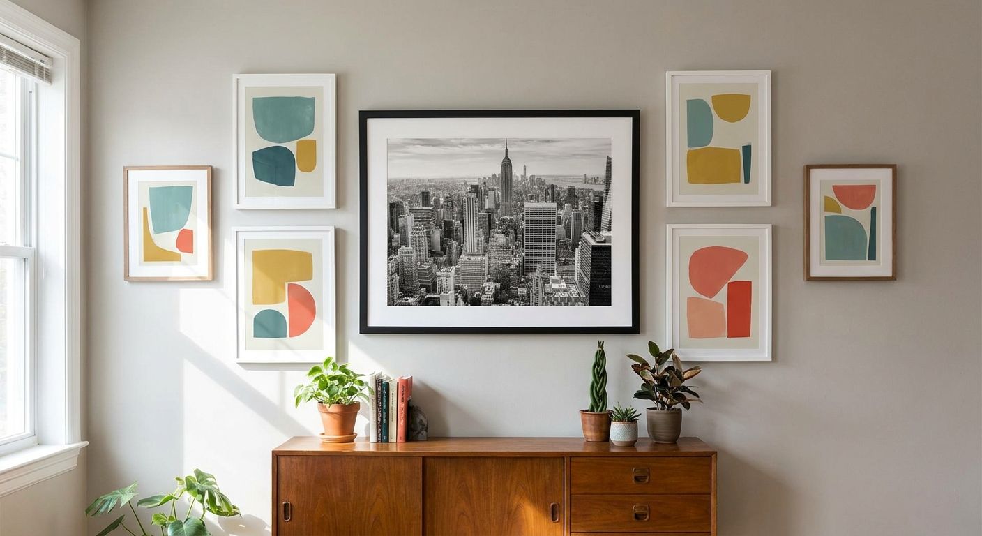
Mixing black and white photography with color wall art works when one palette leads and the other plays a supporting role — not when the two fight for attention on the same wall. The most reliable approach borrows the 60-30-10 rule decorators already use for paint and textiles: black and white photography with color accents reads as intentional when the neutral tone dominates and color shows up in a smaller, deliberate dose.
- Keep black and white photography dominant and use color wall art as the accent, not the other way around.
- The 60-30-10 ratio (60% neutral, 30% secondary tone, 10% color pop) keeps a mixed gallery wall from looking accidental in 2026.
- Match the color accent piece to one existing hue in the room, not to the photo subject.
- Frame color, mat board, and hanging order do more work than the art itself to unify a mixed wall.
- One bold color piece beats three small ones when pairing with black and white photography.
Why this matters
A gallery wall with no plan usually ends up either flat (all black and white, no life) or chaotic (color everywhere, no anchor). Interior stylists lean on black and white photography with color accents specifically because it solves both problems at once — the neutral pieces carry the composition, and the color piece gives the eye somewhere to land.
Get the ratio wrong and even good individual black and white photography wall art can look like it's competing with a random poster. Get it right and the color piece reads like it was chosen, not left over.
How do you mix black and white photography with color wall art?
Follow this order and the wall builds itself instead of fighting you at every step:
- Pick your dominant black and white piece first. This is the largest or most striking photograph, and it sets the visual weight for the whole layout.
- Choose one color accent, not several. A single canvas or framed print in a saturated hue does more than three scattered small pieces.
- Pull the accent color from something already in the room. A rug, a pillow, a lamp base — the color piece should feel borrowed from the space, not dropped into it.
- Group by frame, not by subject. Matching frame finishes (black frames, or all unframed canvas) unify black and white and color pieces faster than trying to match subject matter.
- Place the color piece off-center. Dead center reads as competing with the black and white anchor; slightly off to one side reads as intentional layering.
- Step back at 6 feet before committing to hooks. Ratios that look right up close often look unbalanced from normal viewing distance.
For the physical hanging part once the layout is set, how to hang canvas art without damaging walls covers the hardware side.
Three ways to combine the two, ranked by how forgiving they are
Method 1: One bold color canvas among several black and white photos. This is the safest version of black and white photography with color accents — one saturated piece, four or five neutral ones. Best for first-time gallery walls and rental homes where you're not repainting. Pro: nearly impossible to get wrong. Con: the color piece has to be strong enough to earn its spot, or it just looks stray. Buy.
Method 2: Color-toned black and white photography (sepia, duotone, or tinted prints) next to true color art. This bridges the gap gradually instead of jumping straight from grayscale to full saturation. Best for rooms with warm wood tones or a Japandi palette where hard contrast feels too sharp. Pro: softer transition, easier on the eye. Con: harder to source consistently since tint intensity varies by print. Buy if the room already leans warm.
Method 3: A 50/50 checkerboard split of black and white and color pieces. Equal parts of each, alternated across the layout. Best for maximalist or eclectic rooms that can handle visual noise. Pro: high impact, conversation-starting. Con: breaks the 60-30-10 logic entirely and can look busy in smaller rooms. Wait until you've lived with a simpler ratio first.


Why the ratio varies from room to room
The 60-30-10 split is a starting point, not a rule etched in stone. A few things push it one way or the other:
- Room size. Small rooms hide a bold color piece less easily, so the accent share often needs to shrink below 10% to avoid overwhelming the space.
- Existing wall color. A neutral wall gives color art more room to pop; a already-colorful wall may need the black and white side pushed closer to 70%.
- Natural light. North-facing rooms with less daylight tend to read color more intensely, so a smaller color piece goes further.
- Furniture tone. Warm wood furniture pulls attention toward warm-toned accent art; cool metal or matte black furniture pairs more easily with almost any color.
- Number of pieces on the wall. A two-piece diptych layout has no room to average out an off-balance ratio the way a nine-piece gallery wall does.
- Personal tolerance for contrast. Some interior lovers want the color piece to whisper; others want it to shout. Neither is wrong, but it changes how much color the layout can carry.
For a layout with more than three or four pieces, how to arrange a gallery wall with framed art walks through spacing before you commit to hooks.
Related questions
Can you mix framed black and white photos with unframed color canvas?
Yes — mixing framed and unframed pieces on the same wall works as long as the frame style (or lack of one) repeats at least twice, so it looks like a choice rather than an accident. A single unframed color canvas among several framed black and white photos usually looks like an oversight; two unframed pieces reads as a pattern.
Does black and white photography with color accents work in a small apartment?
Yes, and it's actually easier in a small space because there's less wall to balance. One black and white anchor piece plus one smaller color accent keeps the layout calm without needing a full gallery wall — see best canvas prints for small apartments for scale guidance.
Should the color accent match the room's existing color palette exactly?
No — the accent should relate to the room's palette, not match it precisely. An exact match can flatten the piece into the wallpaper; a closely related tone (a warmer or cooler version of an existing color) keeps the art visible as its own object.
FAQ
What is the best ratio for mixing black and white photography with color wall art?
The best ratio in 2026 is roughly 60% black and white, 30% secondary neutral tone, and 10% color accent. This mirrors the 60-30-10 rule decorators use for any color scheme, not just wall art.
Is it better to use one large color piece or several small ones?
One large or bold color piece works better than several small ones when pairing with black and white photography. Multiple small color pieces compete with each other and dilute the accent effect.
Can sepia or duotone photos count as the color accent?
Sepia and duotone prints act as a bridge tone, not a true color accent, since they still read as neutral from across the room. They work well in warm-toned rooms as a middle step between black and white and full color.
Do frame colors matter when mixing black and white and color art?
Yes, frame color matters more than most people expect. Matching frame finishes across black and white and color pieces unifies the wall faster than trying to color-match the art itself.
How many pieces should a mixed black and white and color gallery wall have?
There's no fixed number, but odd counts (3, 5, 7) tend to look more intentional than even splits. A single strong color piece among four or five black and white photos is a reliable starting layout.
Does this style work with a Japandi or minimalist room?
Yes, minimalist and Japandi rooms often work best with a muted or tinted color accent rather than a saturated one, since the style favors restraint over contrast.
What rooms suit black and white photography with color accents most?
Living rooms and entryways handle this mix well because they're viewed from a distance, which lets the eye process the ratio naturally. Small hallways can work too, but the color piece needs to be scaled down.
Should the color piece go in the center of the layout?
No, centering the color piece often makes it compete head-on with the black and white anchor. Placing it slightly off-center within the layout reads as more deliberate.
One last thing
The detail that actually breaks most attempts at this: people choose the color accent based on the photo's subject matter instead of the room's palette. A sunset photo doesn't need an orange canvas next to it — it needs whatever color already lives in the sofa or the rug. Match the room, not the picture, and the wall holds together in 2026 the same way it will in five years, long after the trend cycle moves on.


