
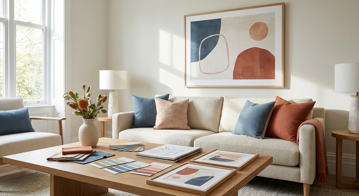
Matching wall art to your room's color palette is a skill, not a guessing game — and once you know the rule of thumb, you'll stop returning canvases that looked perfect online and wrong on the wall.
- Pull 3 colors from your room before shopping — wall art that ignores your palette gets returned most often in 2026.
- Match undertones first: warm rooms need warm-toned art, cool rooms need cool. Buy accordingly.
- The 60-30-10 rule applies to art too — one dominant hue, one supporting, one accent pop.
- Frame color counts as a fourth palette color. A black frame in a warm oak room fights the room, not completes it.
- Step back 10 feet before you commit — color reads differently at scale than on a laptop screen.
Why this matters
Most people shop for wall art the way they shop for a throw pillow: they like it, they buy it, they hang it. That approach works for pillows. It fails for art because a 24x36 canvas is roughly ten times the visual weight of a pillow, and a mismatched palette on that scale reads as clutter, not decor.
Getting the palette right the first time also saves you money in 2026's shipping-and-return economy — large framed pieces are expensive to send back, and most buyers know it before they click checkout. A little color homework up front beats a return label later. It's the same logic that governs accent wall art: the wall's existing color does half the work before the art even arrives.
What you'll need
- A photo of the room in daylight and in lamp light — colors shift under different bulbs
- 3-5 paint chips, fabric swatches, or throw pillow covers already in the room
- A tape measure for the wall space
- A printed or digital mockup of the art candidate, sized to scale if possible
- 15-20 minutes with no distractions — this is not a five-minute decision on a big piece
The steps
1. Photograph the room and pull your palette
Take two photos: one in natural daylight, one at night with your usual lamps on. Colors that look neutral gray at noon can turn blue-green under a warm bulb, and that shift matters when you're matching art. Pull the three dominant colors from both photos using any free color-picker tool or just by eye — sofa, rug, and one accent object like a lamp base or throw.
Expected outcome: a working palette of 3 colors, roughly in the proportions they appear in the room. Common mistake: shopping from memory instead of the photo. Memory rounds colors up to "blue" or "beige" when the actual tone is a muddy teal or a warm greige — and that gap is exactly what causes a mismatch.
2. Apply the 60-30-10 split to your wall art
The interior design rule of thumb — 60% dominant color, 30% secondary, 10% accent — applies to a single canvas, not just a whole room. Look at the art candidate and ask which color takes up the most visual space. If your room's dominant color is a warm cream and the art's dominant color is a cool slate blue, you've got a fight, not a pairing.
Expected outcome: you can name the art's dominant, secondary, and accent color in under 10 seconds. Common mistake: falling for a piece because of one striking accent color (a coral streak, a gold leaf detail) while ignoring that its dominant background clashes with the room.
3. Match undertones before you match hues
This is the step almost everyone skips, and it's the one that fixes 2026's most common wall art complaint: "it looked right online and off on the wall." Every color has a warm or cool undertone — even white walls do. If your room leans warm (yellow-based whites, oak floors, brass fixtures), pick art with warm undertones even if the surface color is different. A cool-toned abstract in a warm room will look slightly gray and flat no matter how good the composition is.
Expected outcome: art that reads as "it belongs here" rather than "it's nice but off." Common mistake: matching hue (blue-to-blue) while ignoring undertone (a cool navy next to a warm teal rug still clashes).
4. Decide: harmony or contrast
You have two honest paths. Harmony pulls the art's colors directly from your existing palette — safe, cohesive, easy to live with. Contrast picks one bold color absent from the room to create a focal point — riskier, but it's how a lot of the strongest gallery walls get built. Neither is wrong; pick based on whether the room already feels finished (add contrast) or still feels bare (add harmony).
Expected outcome: a clear rule for every future purchase in that room, not a one-off decision. Common mistake: trying to do both at once — one contrast piece is a focal point, three contrast pieces is chaos.
5. Treat the frame as a fourth color
A black frame, a natural oak frame, and a white frame are not neutral — they're color decisions. Black reads cool and modern even on a warm-toned print. Oak reads warm even on a cool-toned print. If your room's hardware, trim, or furniture legs are already a metal or wood tone, match the frame to that first, then worry about the print inside it.
Expected outcome: the frame disappears into the room instead of competing with the art. Common mistake: picking the frame color last, as an afterthought, after already committing to the print.
6. Step back and test at distance
Before you hang anything permanently, prop the piece against the wall and walk to the doorway — 8 to 10 feet away is the distance most people actually view wall art from. Colors that look intense up close often flatten out at that range, and colors that looked subtle on a screen can suddenly dominate the room.
Expected outcome: confidence the color choice holds up at real viewing distance, not just at arm's length. Common mistake: judging the palette from a phone screen mockup instead of the physical wall — screen color rendering is never fully accurate.


Each of these four pieces demonstrates a different palette lesson: SunriseIn Copenhagen carries a warm dominant tone that reads well against oak and cream rooms, while London Glow leans cooler and pairs with slate or charcoal palettes. Autumnat Rosenborg is a harmony piece — its warm rust and gold tones pull straight from a typical autumnal living room palette — and Lumière d'Amour works as a contrast piece, dropping a single soft pink accent into an otherwise neutral space.
Troubleshooting
The art looks washed out on the wall even though it looked vivid online. Screen colors run brighter and more saturated than print. Check the undertone match from Step 3 before blaming the piece itself — a slight undertone mismatch reads as "faded" even when the print quality is fine.
Everything in the room now looks too matchy. You over-applied harmony. Swap one piece for a contrast choice — a single color absent from the room — to break the monotony without starting over.
The frame fights the print. This usually means Step 5 got skipped. A cool black frame around a warm-toned print in a warm room is the single most common frame mistake seen in 2026 return requests. Switch frame tone before switching the art.
A gallery wall of mixed pieces feels chaotic. Gallery walls need one unifying thread — frame color, mat color, or a repeated accent hue across all pieces — even when the subjects differ. Pick one and apply it to every piece in the grouping.
The piece feels right in the store photo but wrong once hung. Lighting temperature changed. Recheck against your nighttime lamp photo from Step 1, not just the daylight one.
Tools and resources
- Free browser color-picker tools for pulling exact hex values from your room photo
- A physical paint chip or fabric swatch, held directly against any art candidate before buying
- Canvas art sets for gallery walls — useful once you've nailed a single-piece palette and want to expand into a grouping
- Style-specific guides for palettes that already lean toward a defined mood — coastal, farmhouse, mid-century, and boho all come with built-in color rules worth knowing before you shop
What to do next
Once a single wall's palette is locked in, the next decision is scale — how big the piece needs to be relative to your furniture, which is a separate rule from color matching entirely. If you're building out a full gallery wall rather than a single anchor piece, get the layout and frame consistency sorted before you add more colors into the mix; too many palette decisions at once is how gallery walls go wrong.
FAQ
How do I match wall art to my room's color palette?
Pull 3 dominant colors from your room's existing decor, then choose art where the dominant color and undertone align with those. Warm rooms need warm-toned art; cool rooms need cool-toned art, regardless of the exact hue.
Should wall art match the walls or the furniture?
Match the furniture and soft decor first, since walls are often neutral. Art that echoes your sofa, rug, or accent pillow colors reads as intentional rather than accidental.
Is it better to match colors exactly or use contrast?
Contrast makes a stronger focal point; exact matching creates a calmer, more cohesive room. Use contrast in a room that already feels finished and harmony in a room that still feels bare.
Does frame color count as part of the color palette?
Yes. Black, oak, and white frames each carry their own warm or cool undertone and should be matched to your room's existing metal or wood tones before you finalize the print.
What's the 60-30-10 rule for wall art?
It's a proportion guide borrowed from interior design: 60% dominant color, 30% secondary, 10% accent. Applied to a single canvas, it means checking which color takes up the most visual space before buying.
Why did my wall art look different once I hung it?
Screen colors run more saturated than printed colors, and lighting temperature changes color perception. Always check a piece against your room in both daylight and lamp light before committing.
How many colors should be in one piece of wall art?
Three is a workable ceiling for most rooms — a dominant, a secondary, and one accent. More than that competes with the room's own palette instead of complementing it.
Can I mix warm and cool tones in the same room?
You can, but pick one to dominate. A room that's 80% warm with one cool accent piece reads as curated; a 50/50 split usually reads as unplanned.
One last thing
The undertone check in Step 3 fixes more mismatched wall art than any other single step in this guide — most people never think to check it because they're taught to match hue, not temperature.
“Match hue and you might get lucky. Match undertone and you get it right every time.”


