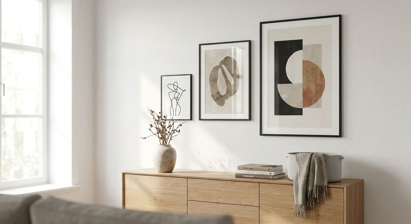
Earth tone wall art for warm, grounded interiors means canvas prints, framed pieces, and original paintings built from terracotta, clay, olive, sand, and rust instead of black, white, or cool grey, with the goal of making a room feel settled rather than staged. The palette works because it repeats materials a room already owns - wood floors, leather seating, linen drapes - so the art blends into what's already there instead of fighting it. That's a different job than a bold abstract print does, and it changes how you shop for it.
- Earth tone wall art works best when it repeats a color already in your wood, leather, or stone rather than adding a brand-new hue.
- Canvas prints hold warm pigment better than glossy posters under direct light; framed prints under glass suit dining rooms.
- Size up on one anchor piece per wall instead of scattering three small ones - warm neutrals recede more than bright colors.
- Gioia Wall Art's 2026 landscape and botanical canvases lean into earthy palettes without matching a paint chip exactly.
Why earth tone wall art matters for warm, grounded interiors
Paint trends move in and out of a room in a weekend; wall art doesn't need a five-gallon bucket to test. A large canvas print in clay or olive does the job a feature wall used to do, and it comes down just as easily when your taste shifts. That flexibility matters more in 2026 than it did when grey-and-white minimalism was the safe default and warmth felt like a risk.
Earth tones also solve a real problem: most rooms have wood tones that don't match anything else in the space. Mustard and gold wall art or a rust-heavy print pulls those clashing wood tones into one deliberate story instead of leaving them to compete. That's the actual job earth tone wall art does - it's color management, not decoration.
Map your base earth tones before you shop
Decide which two or three earth tones will repeat through the room before you open a single product page. Trying to cover the whole spectrum - rust, olive, ochre, chocolate, sand - in one print usually reads busy instead of grounded.
- Pull the dominant tone from your largest fixed material: hardwood floor, brick, or stone
- Pick one accent tone from soft goods already in the room - a rug, throw, or curtain
- Limit the palette to 2-3 named tones (terracotta, olive, sand) before you browse
- Photograph the room in daytime light and match tones against that photo, not a screen
Match undertones to your existing wood and leather
Wood runs warm (honey, walnut, red oak) or cool (grey-washed, ashy), and earth tone prints only look grounded when they lean the same direction as your furniture.
- Hold a fabric or paint swatch from the print against your floor or table in daylight
- Avoid pairing warm terracotta art with cool grey-washed oak - the mismatch shows fast
- Match wall art that complements your wood furniture tones before you commit to a print
- When in doubt, sand and clay read neutral enough to sit on almost any wood tone
Pick the right format: canvas, framed, poster, or original
Format changes how saturated an earth tone looks and how much upkeep the piece needs, not just how it hangs.
- Canvas prints hold matte pigment and read warmer under incandescent bulbs
- Framed prints under glass suit dining rooms and formal spaces where glare is manageable
- Posters work for rentals and temporary spaces but fade faster in direct sun
- Original paintings carry visible texture and brushwork that flat prints can't reproduce
Size the piece to the wall, not the trend
An earth tone print that's too small looks like a swatch test, not a finished wall. Grounded rooms read calmer with one confident anchor than three small pieces competing for attention.
- Measure the wall's usable space, typically 60-75% of the width above furniture
- Confirm the right canvas size for your wall before you order anything
- When stuck between two sizes, size up - earth tones recede more than bright colors, so bigger reads better
- Leave at least 6-8 inches between the top of furniture and the bottom of the frame
Layer texture and one cool accent for contrast
An all-warm room can flatten out visually. One cool or neutral element - black-and-white photography, a metal frame, a grey ceramic vase - keeps an earth tone room from reading monochrome.
- Add one black-and-white or muted-blue piece per gallery grouping
- Mix matte canvas with one glossy or textured original painting for depth
- Use metal or matte-black frames as a cool counterpoint to warm pigment
- Keep the cool accent under 20% of the total wall area
Test the piece in your actual light before you commit
Earth tones shift more under artificial light than cool palettes do. A terracotta print that looks rich at noon can look muddy under a 2700K bulb at night.
- View any digital proof in both daylight and evening lamp light before ordering
- North-facing rooms flatten warm pigment - check the room's actual light direction first
- Order a smaller print first if the room gets limited daylight
- Warm-white bulbs (2700-3000K) support earth tones better than daylight-balanced (5000K) bulbs
Comparing your options for earth tone wall art
| Option | Best for | Key limitation |
|---|---|---|
| Canvas print | Living rooms and bedrooms wanting warm, matte pigment | Texture can dull fine detail in busy patterns |
| Framed print under glass | Dining rooms and formal spaces | Glare under bright, direct light |
| Poster / paper print | Rentals, temporary spaces, kids' rooms | Fades faster in direct sun, less durable long-term |
| Original painting | Statement walls, one-of-a-kind pieces | Higher cost, no exact repeat if you need a matching set |
Canvas wins for most earth tone rooms because matte pigment holds warm color better than glossy paper under normal room lighting.
Earthy landscape picks to shop now
If you want a shortcut past the swatch-matching, a few pieces in the current Gioia Wall Art collection lean into the terracotta-and-olive range through landscape and travel imagery rather than a flat color block. These work as the single anchor piece the sizing step above calls for.


Common mistakes people make with earth tone wall art
- Buying one small print and expecting it to warm up an entire wall - undersized art gets lost against warm neutrals faster than it does against plain white.
- Mixing too many named tones (rust, ochre, chocolate, sand) in a single piece, which reads muddy instead of grounded.
- Ignoring the room's light direction, then wondering why a rich terracotta print looks flat by evening.
- Matching the print to the wall paint exactly instead of to the wood and leather already in the room - art matched to paint disappears instead of anchoring the space.
- Skipping a cool accent entirely, leaving an all-warm room with no visual rest point.
If every piece in the room is warm, the room stops reading as designed and starts reading as one temperature.
FAQ
What is earth tone wall art?
Earth tone wall art is any canvas print, framed print, or painting built from warm neutrals like terracotta, clay, olive, sand, and rust rather than black, white, or cool grey. It's used to ground a room and echo materials like wood and leather that are already in the space.
Is earth tone wall art still popular in 2026?
Yes, warm neutral palettes have held steady through 2026 as a counterpoint to the grey-and-white minimalism that dominated the previous decade. Earth tones read as calmer and more lived-in than stark monochrome schemes.
What colors count as earth tones for wall art?
Terracotta, clay, olive, sand, rust, ochre, and chocolate brown are the core earth tone family. Most grounded rooms work best with 2-3 of these repeated rather than all of them in one piece.
Does earth tone wall art work with grey walls?
Yes, earth tone art contrasts cleanly against grey walls and often reads as the warmest object in the room. The contrast works best when the print also picks up a wood or leather tone already present in the furniture.
Should earth tone wall art match my wood furniture exactly?
No, it should lean the same direction (warm or cool) as your wood, not match it exactly. An exact match tends to disappear against the furniture instead of standing as its own anchor.
What size earth tone wall art should I buy for a large living room wall?
Cover roughly 60-75% of the usable wall width above your furniture, and size up rather than down when unsure. Warm neutrals recede visually more than bright colors, so undersized pieces get lost faster.
Is canvas or framed print better for earth tone wall art?
Canvas holds matte, warm pigment better under normal room lighting and suits living rooms and bedrooms. Framed prints under glass work better for formal dining rooms where glare is manageable.
How do I keep an earth tone room from looking dull?
Add one cool or neutral accent - a black-and-white photograph, a metal frame, or a grey object - kept to under 20% of the wall area. Without that contrast point, an all-warm room can flatten out visually.
One last thing
The single biggest lever in an earth tone room usually isn't the print - it's the bulb. Swapping a daylight-balanced 5000K bulb for a warm-white 2700-3000K bulb changes how a terracotta canvas reads more dramatically than swapping the print itself, and it costs a fraction of reordering art in 2026.