
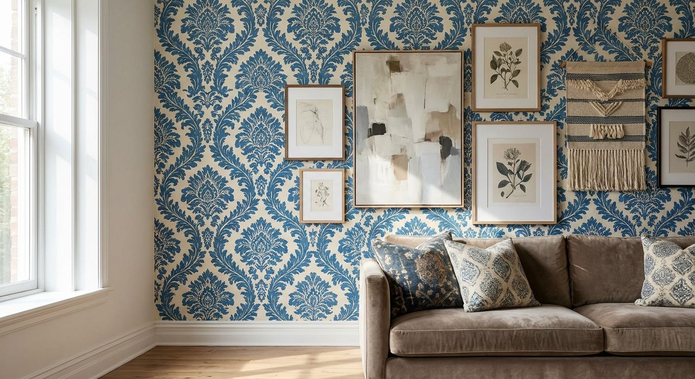
Patterned wallpaper is not a reason to skip wall art — it's a reason to choose it more carefully. Get the balance wrong and your walls read as clutter; get it right and the pattern becomes a backdrop that makes the art pop.
- Match wall art to your wallpaper's scale, not its color, to avoid visual competition.
- Solid-ground or abstract canvas prints hold up better than busy florals on patterned walls.
- Leave at least 4-6 inches of visible wallpaper around framed pieces so the pattern still breathes.
- Pull one wallpaper color into your art instead of matching all of them for wall art for patterned wallpaper that actually works.
- Gioia Wall Art's abstract and landscape canvas prints are a safe starting point for busy rooms in 2026.
Why this matters
A lot of decorating advice tells you to "just add art anywhere." That falls apart the second your wall already has a print, a stripe, or a botanical repeat running across it. Two patterns competing for attention is the single most common reason a room feels busy instead of styled.
The fix isn't avoiding art on patterned walls — it's matching wall art to your room's color palette with the wallpaper as the starting point, not an afterthought. Once you treat the wallpaper as the loudest element in the room, everything else gets easier to choose.
What you'll need
- A photo of the wallpaper in natural daylight, so you can judge undertone accurately
- A tape measure and painter's tape for mocking up sizes on the wall
- One or two candidate canvas prints or framed pieces, ideally in a single dominant color rather than a busy multi-color scene
- A sense of the wallpaper's repeat scale (small ditsy print vs. large-scale mural pattern)
- 20-30 minutes to test placement before committing to a hanging plan
The steps
1. Read the wallpaper's scale first
Before you shop, classify your wallpaper as small-scale (tight florals, thin stripes, geometric repeats under 2 inches) or large-scale (oversized botanicals, wide stripes, mural-style panels). Small-scale patterns can handle bolder, larger art because the pattern reads almost like a texture from across the room. Large-scale patterns need quieter, simpler art or they'll fight for the eye's attention. Skip this step and you'll end up returning art that looked fine online but chaotic on the wall.
2. Match value contrast, not color
Forget trying to color-match your art to the wallpaper exactly — match the lightness or darkness instead. A dark, moody wallpaper needs art with enough contrast to stand out, while a soft pastel print needs art that's similarly muted or it will look like it's shouting. This one adjustment solves most of the "my art disappears" complaints Gioia Wall Art hears from customers with patterned rooms.
3. Pick one dominant motif and let the wallpaper handle the rest
If your wallpaper already has florals, a second floral piece nearby usually overloads the wall. Choose a different motif — abstract, landscape, or a simple still life — so the eye has one busy element and one calm one to rest on. This is the single biggest lever for making wall art for patterned wallpaper look intentional instead of accidental.
4. Size down and simplify the frame
On a patterned wall, oversized statement pieces can overwhelm the room fast. As a starting rule, keep art to roughly 60-75% of the width of the furniture below it, and lean toward simple black, white, or natural wood frames instead of ornate ones — an ornate frame plus a busy wallpaper is one competing detail too many. Use Gioia's canvas size guide if you're unsure what dimension actually fits your furniture.
5. Leave breathing room around every piece
Patterned walls need more negative space around framed art than plain walls do, not less. Aim for a minimum of 4-6 inches of visible wallpaper on all sides of a single canvas, and widen the gaps between pieces if you're hanging a small grouping. Crowd the pieces together and the whole arrangement reads as one indistinct blob against the pattern.
6. Test placement before you commit
Tape a paper cutout the size of your chosen canvas directly to the wall and live with it for 24-48 hours. Walk past it at different times of day — patterned wallpaper shifts in appearance under warm evening light versus daytime sun, and art that looked balanced at noon can look off by 8pm. This step catches problems before nail holes do.
7. Pull one wallpaper color into the art, not all of them
Scan the wallpaper for its most repeated accent color, then choose art where that same color shows up as a secondary note, not the dominant one. This creates a visual thread between wall and art without turning the room into a matched set, which almost always looks dated by 2026 standards.
8. Balance a busy wall with quiet furniture
If the wallpaper and the art are both doing a lot of visual work, the furniture in front of them needs to stay simple — solid upholstery, plain wood tones, minimal throw pillow patterns. This is the step people skip most often, and it's usually why a room with great individual pieces still feels overstuffed.


Troubleshooting
The art disappears into the wallpaper. Your value contrast is too close — swap in a piece with more light-to-dark range, or add a frame with visible width to create a clean edge against the pattern.
The room feels busier after hanging art, not better. You likely picked a matching motif (floral on floral, geometric on geometric). Switch to a different subject entirely — an abstract or landscape piece resets the visual rhythm.
The frame clashes with the wallpaper's undertone. Warm wallpaper undertones fight cool-toned metal frames and vice versa. Test the frame finish against a wallpaper swatch before hanging, not after.
A gallery wall looks cluttered on a patterned wall. Patterned walls can't absorb tight gallery groupings the way plain walls can. Widen the spacing to at least 3-4 inches between frames, or move the gallery arrangement to a plain accent wall instead — see how that trade-off works for wall art on accent walls.
Colors from the art and wallpaper are actively fighting. Pull the art's palette back to one shared accent color plus neutrals. Two competing color stories in one sightline rarely resolves itself with more art — it usually needs less.
Tools and resources
- How to match wall art to your room's color palette — for pulling the right accent color from your wallpaper
- How to choose the right canvas size for your wall — for getting proportions right against furniture
- How to hang canvas art without damaging walls — useful once you're ready to commit to nail placement
- A painter's tape mock-up before drilling, especially on rented walls or freshly papered rooms
What to do next
Once you've settled on scale and value contrast, the next decision is usually whether to commit to one statement piece or lean into a busier, maximalist mix. If your instinct is toward more pattern-on-pattern rather than less, eclectic wall art for maximalist interiors walks through how to layer prints without the room tipping into visual noise.
FAQ
What's the best wall art for a room with patterned wallpaper?
Abstract, landscape, or solid-ground canvas prints work best because they don't compete with the wallpaper's motif. Pick one accent color from the wallpaper to repeat in the art instead of matching the full palette.
Is bold wall art better than simple art on patterned walls?
Simple, quieter art almost always wins on patterned walls in 2026 decorating trends. Bold art plus bold wallpaper usually reads as cluttered rather than intentional.
How much space should I leave between framed art and patterned wallpaper?
Leave at least 4-6 inches of visible wallpaper around a single framed piece. Tighter spacing works on plain walls but crowds a patterned one.
Can I put a gallery wall on patterned wallpaper?
Yes, but widen the gaps between frames to at least 3-4 inches so the grouping doesn't blur into the pattern. A tighter, salon-style hang usually works better on a plain accent wall instead.
Should wall art match my wallpaper color exactly?
No — matching the exact color usually looks flat and dated. Pull one secondary accent color from the wallpaper into the art instead, and let the rest of the palette contrast.
What frame color works best with patterned wallpaper?
Simple black, white, or natural wood frames hold up best because ornate frames add a third competing detail. Match the frame's undertone (warm or cool) to the wallpaper's undertone before hanging.
Does the scale of the wallpaper pattern matter for choosing art size?
Yes. Small-scale, tight repeats can handle larger art since the pattern reads as texture from a distance. Large-scale, oversized wallpaper prints need smaller, simpler art or the wall becomes visually overloaded.
One last thing
If you're genuinely unsure which way to go, default to a single abstract or landscape canvas over a matching set — one confident piece almost always outperforms three smaller ones on a patterned wall, because it gives the eye exactly one place to land instead of three.


