
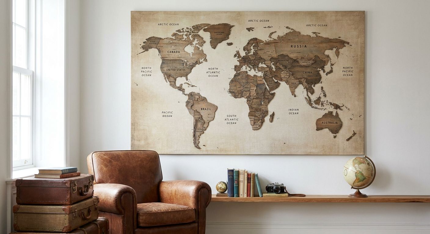
Travel lovers' world map wall art is a large-format print that turns a blank wall into a visual travel journal, built to hold up as the centerpiece of a room rather than a filler piece. This segment shops differently than the average wall art buyer: they want scale big enough to read country names from across the room, a palette that matches an existing gallery of postcards and photos, and a design that ages well as more pins and stickers of visited places get added over time.
- World map wall art works best at 36-48 inches wide for a true statement wall in 2026 layouts.
- Vintage-toned and muted-palette maps pair more easily with travel photography than bright political maps.
- Gioia Wall Art's canvas format holds up better than framed glass in humid entryways and sunrooms.
- Push-pin or scratch-off maps solve the 'track where I've been' request without a custom order.
- Undersized maps are the most common mistake travel-loving buyers make in 2026 gallery wall plans.
Why world map wall art matters for travel lovers
A generic map print reads as office decor. A map chosen for a travel lover's home has to do double duty: it needs to look intentional as art and function as a personal record of where someone has actually been. That's a different brief than picking wall art for, say, a mudroom or a waiting room.
Travelers also tend to build out a themed corner rather than hang one lone print, which is why this piece pairs naturally with vintage travel posters from destinations they've actually visited. The map becomes the anchor; everything else — ticket stubs, framed photos, small posters — gets arranged around it. Gioia Wall Art's catalog is built around that layering approach rather than treating a world map as an isolated purchase.
The practical constraint most buyers hit first is size. A map that's too small for the wall reads as an afterthought no matter how good the design is, and that's the mistake worth solving before color or style even enters the conversation.
Pick a map style that matches the travel story you're telling
Not every world map fits every home. A minimalist line-art map suits a Japandi or Scandinavian living room; a distressed, sepia-toned map fits a study or a home library lined with books from actual trips.
- Vintage/antique-style maps for libraries, studies, and traditional living rooms
- Minimalist line-art maps for modern, Japandi, or Scandinavian interiors
- Bold political maps in saturated color for kids' rooms, playrooms, or homeschool spaces
- Watercolor or painterly maps for soft, romantic bedrooms and nurseries
- Push-pin or scratch-off maps for anyone who wants to visibly track visited countries
Size the map to the wall, not the other way around
The general interior design rule of thumb is to size wall art at roughly 60-75% of the width of the furniture it hangs above — a sofa, a console, or a bed frame. Undersized maps are the single most common complaint this segment runs into after a purchase.
- Measure the furniture width first, then work backward to the print size
- Go up to an extra-large canvas (60+ inches wide) for a true statement wall above a sofa or bed
- Use the canvas size guide before ordering if the wall is an unusual shape or height
- For narrow hallways, choose a portrait-oriented or smaller landscape map instead of forcing a wide one to fit
- Leave at least 6-8 inches of breathing room between the map's frame and adjacent furniture or trim
Match the map's palette to the room's existing color scheme
A world map in the wrong palette fights everything else in the room instead of anchoring it. Muted, warm-toned maps sit well in neutral or earthy rooms; high-contrast black-and-white maps work in modern spaces with a lot of white or gray already in play.
- Sepia and cream tones for neutral, rental-friendly, or farmhouse rooms
- Navy and cream for coastal or nautical-leaning spaces
- Black-and-white line maps for modern minimalist rooms with limited color already on the walls
- Soft pastel or watercolor maps for nurseries and kids' rooms
- Gold-accented or metallic maps for glam or Hollywood Regency interiors
Decide where in the home the map actually goes
World maps read differently depending on placement. Above a desk, it becomes a conversation piece on video calls. In an entryway, it's the first thing guests see. In a hallway, it needs to survive foot traffic and bumps.
- Home office: doubles as a background piece for video calls and inspires travel planning
- Entryway or foyer: sets a well-traveled tone before guests even reach the living room
- Kids' bedroom or playroom: works as an educational piece as much as decor
- Above a bed: needs to be large enough to fill the headboard width without looking cropped
- Hallway: choose a more durable, low-glare format since these walls take more contact than others
Build a small travel-themed gallery around it
A single world map rarely needs to stand alone. Travel lovers tend to already own photos, ticket stubs, or small prints from trips, and the map works best as the anchor piece those items are arranged around.
- Frame 3-5 travel photos in a consistent frame color and hang them in a loose grid around the map
- Add one or two smaller vintage travel posters from specific cities already visited
- Keep the map as the largest single piece so the eye lands there first
- Use matching mat board or frame finishes across the smaller pieces for a pulled-together look
- Leave at least 2-3 inches of spacing between the map and surrounding smaller frames
Hang it and keep it looking sharp
A map this size needs the right hardware and the right wall prep, especially in a rental or a high-traffic hallway.
- Use a level and painter's tape to mark the exact position before drilling or hanging
- Check the wall type first — drywall, plaster, and brick each need different anchors
- Hang the center of the map at roughly eye level, around 57-60 inches from the floor
- Avoid direct sun exposure on canvas prints to prevent fading over years of display
- Dust with a dry microfiber cloth rather than any liquid cleaner on canvas surfaces
Comparing world map wall art formats
| Option | Best for | Key limitation |
|---|---|---|
| Canvas print | Statement walls, sofas, beds | Heavier, needs proper wall anchors for large sizes |
| Framed art print | Home offices, entryways | Glass can glare under overhead lighting |
| Unframed poster | Renters, dorms, budget-conscious buyers | Less durable long-term, needs its own frame eventually |
| Push-pin/scratch map | Trackers who want a visible travel log | Novelty finish reads more casual than fine art |
| Multi-panel map set | Large open-plan or loft walls | Needs precise, even spacing to look intentional |
Verdict: for most travel lovers hanging a statement piece in 2026, a large canvas world map is the safer buy over a framed print, since it skips the glare problem and holds up better in humid or sunlit rooms without a glass surface to worry about.
Common mistakes travel lovers make with world map wall art
- Going too small. A 16x20 map above a queen bed or a sofa reads as an afterthought, not a statement.
- Ignoring the room's existing palette. A bright, saturated political map clashes fast in a muted, neutral living room.
- Choosing a highly detailed map for a small wall. Tiny country labels become illegible at smaller print sizes and just look busy.
- Hanging too high. Centering the map at art-gallery eye level (57-60 inches) beats guessing based on ceiling height.
- Treating it as a lone piece. Travel lovers get more visual payoff pairing the map with a couple of smaller travel prints than hanging it in isolation.
FAQ
What size world map wall art should I buy for a living room?
Size the map at roughly 60-75% of the width of the sofa or console table below it. For a standard 84-inch sofa, that puts a large canvas print in the 48-60 inch range for a proper statement wall in 2026.
Is canvas or framed print better for world map wall art?
Canvas holds up better in sunlit or humid rooms since there's no glass to glare or fog. Framed prints look sharper in controlled-light spaces like a home office or study.
Does a push-pin world map look like real art or just a novelty?
A push-pin or scratch-off map reads more casual than a fine art print, so it fits playrooms and offices better than a formal living room or entryway.
What color world map works best in a neutral room?
Sepia, cream, and muted earth-tone maps blend into neutral and farmhouse-style rooms without fighting existing furniture colors. Bright political maps tend to clash in that same setting.
Where should I hang a world map in a home office?
Behind the desk chair works best since it becomes the visible background on video calls. Centering it at 57-60 inches from the floor keeps it at natural eye level for anyone standing in the room.
Can I pair a world map with travel photos on the same wall?
Yes, and it's the most common way travel lovers style this piece. Keep the map as the largest single item and arrange 3-5 smaller framed photos or posters loosely around it.
How do I keep a canvas world map print from fading?
Keep it out of direct sunlight, since UV exposure fades canvas prints faster than any other factor over time. Dust it with a dry microfiber cloth instead of any liquid cleaner.
Is a multi-panel world map set worth it over a single canvas?
Multi-panel sets suit large open-plan or loft walls where a single canvas would look small by comparison. They need more precise, even spacing than a one-piece print to look intentional rather than mismatched.
One last thing
The detail travel lovers overlook most in 2026 isn't the map style — it's the finish under different lighting. A glossy or glass-framed map catches glare from overhead fixtures and windows, which is exactly why a matte canvas print reads better in rooms with a lot of natural light, like sunrooms or south-facing living rooms. Check the light in the room before the design.


