
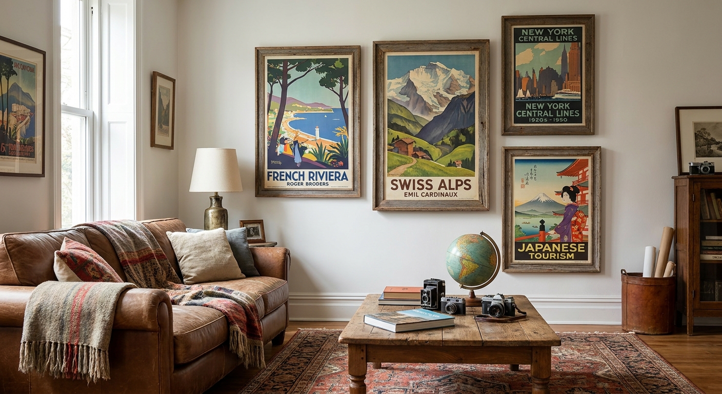
If you've stamped a passport more than a few times, a poster of a city you never visited feels like a lie on your wall. This guide covers how to pick vintage travel posters for a well-traveled home in 2026 — which cities and color stories actually hold up, which formats last, and which four picks from Gioia Wall Art's collection are worth the wall space.
- Vintage travel posters work best when tied to a city you've actually stood in, not a generic postcard scene.
- London Glow and Sydney Harbour are the safest 2026 picks for entryways and reading nooks — Buy.
- Sunrisein Amsterdam is the wildcard pick for a bolder palette — Consider before committing to a full gallery wall.
- Skip poster sets with no shared color story — they read as clutter, not curated travel decor.
- A single 24x36 print usually outperforms a busy grid of five small posters in a well-traveled home.
Why this matters
A well-traveled home isn't defined by how many stamps are in a drawer somewhere — it's defined by whether the walls actually say something about where you've been. Generic "wanderlust" posters from big-box stores tend to look identical from house to house, which defeats the point.
The fix isn't buying more posters. It's buying fewer, better ones, and knowing how to arrange a gallery wall with framed art so the collection reads as a story instead of a scrapbook. Vintage travel posters done right pull double duty in 2026 decor: they're a conversation starter and a genuine style anchor for entryways, hallways, and home offices.
Who this is for
This guide is built for people who travel enough that one poster of "Paris" doesn't cut it — they want the specific city, the specific light, the specific mood of a trip that actually happened. Think frequent flyers furnishing a first home, couples building a shared wall of the places they've been together, or empty-nesters converting a guest room into a travel-themed retreat. If your bookshelf has more guidebooks than novels, keep reading.
What to look for in vintage travel posters for well-traveled homes
Color story that fits your palette
A poster with a warm amber sunrise reads completely differently in a cool gray living room than in a terracotta one. Pick pieces where the dominant tones — teal harbor water, golden hour glow, soft rose skylines — already exist somewhere else in the room, whether that's a throw pillow or a rug. This is the single biggest reason a "good" poster looks wrong once it's hung; it's a palette problem, not a taste problem, and it's worth cross-checking against a guide on how to match your wall art to your room's color palette before you order.
Scale for the wall you actually have
Travel posters were originally designed to be read from across a train platform, which means bold graphic scale is baked into the genre. A poster under 18x24 tends to disappear on anything bigger than a hallway wall. Go bigger than feels comfortable — most well-traveled homes underestimate scale, not overestimate it.
City or landmark focus, not a generic collage
The strongest pieces name the place: a Copenhagen skyline, a Venice canal at dusk, a Sydney Harbour bridge — not an unlabeled "beach scene" that could be anywhere. Specificity is what makes a piece feel personal instead of decorative filler.
Single statement vs. curated set
One large print does more work than four small ones scattered without a plan. If you do want multiples, treat them like a set with one shared framing style and one shared palette, not a random assortment of city posters bought over time.
Framed vs. unframed
Framed prints read more finished and more "gallery" in formal spaces like entryways and dining rooms; unframed canvas or paper prints suit more relaxed rooms like a home office or reading nook. Neither is wrong — the room dictates the choice, not the poster.
Print material that holds up
Canvas prints and fine art paper prints age differently under direct light. A north-facing hallway is safer for either; a sun-drenched south window calls for indirect placement regardless of material, since UV fading is the most common regret with statement pieces after a year or two on the wall.
Top picks for 2026
The safe pick — London Glow A warm-toned London skyline at $179.99, this one reads as classic and matches nearly any neutral or warm palette without a redesign. It's the piece to buy first if you're only committing to one statement print this year. Buy.
The wildcard — Sunrisein Amsterdam Cooler, moodier, and more saturated than the London piece, this $179.99 print suits a home already leaning into blues and teals rather than warm neutrals. It rewards a room that's ready to be a little bolder. Consider.
The crowd-pleaser — Sydney Harbour At $179.99, this is the pick for coastal-leaning homes or anyone whose most memorable trip involved water. It pairs naturally with the kind of palette used in coastal wall art for beach houses, so it's an easy second piece if London Glow is already up. Buy.
The gifting pick — Her City, His Heart, Venice Priced at $179.99, this romantic Venice piece is built for shared milestones — anniversaries, honeymoons, first apartments after a proposal trip. It's a stronger gift than a solo statement piece for most living rooms. Consider.


What to avoid
- Muddy, low-contrast reproductions. Cheap reprints of classic travel posters lose the crisp color separation that made the originals iconic — if the sky and the title text blur together, skip it.
- Passport-stamp cliché sets. Generic "wanderlust" collages with no named city rarely age well once the novelty wears off — they read as decor filler within a year.
- Overly matchy sets bought all at once. A row of five identical-frame city prints purchased in one order tends to look like a hotel corridor rather than a home that actually traveled.
Verdict comparison
| Pick | Best For | Style Focus | Price | Verdict |
|---|---|---|---|---|
| London Glow | Entryways, warm neutrals | Classic skyline | $179.99 | Buy |
| Sunrisein Amsterdam | Bold, blue-leaning rooms | Cool canal sunrise | $179.99 | Consider |
| Sydney Harbour | Coastal, water-view homes | Harbor scene | $179.99 | Buy |
| Her City, His Heart, Venice | Gifting, shared milestones | Romantic canal | $179.99 | Consider |
FAQ
What are the best vintage travel posters for a well-traveled home in 2026?
London Glow and Sydney Harbour are the safest 2026 picks because their palettes work in nearly any neutral or coastal room. Sunrisein Amsterdam suits a home already leaning into bolder blues.
Should vintage travel posters be framed or unframed?
Framed prints suit formal spaces like entryways and dining rooms, while unframed canvas works better in relaxed spaces like a home office. The room decides, not the poster style.
What size travel poster works for a hallway or entryway?
Go bigger than feels comfortable — anything under 18x24 tends to disappear once it's on the wall. Most well-traveled homes underestimate scale rather than overestimate it.
Is a single large travel poster better than a set of small ones?
Yes, in most rooms a single large statement print reads stronger than four or five small ones. If you want a set, keep the frame style and color palette consistent across every piece.
How much does a vintage travel poster print cost in 2026?
Most curated travel poster prints run $179.99 to $209.99 depending on size and paper or canvas finish. Framed options typically sit at the higher end of that range.
Do vintage travel posters fade in direct sunlight?
Yes — canvas and fine art paper prints both fade faster under direct UV exposure. A north-facing hallway is safer than a sun-drenched south window regardless of material.
Can travel posters work in a gallery wall with other art styles?
Yes, as long as the color palette is shared across pieces. Mixing a travel poster with unrelated styles works better once you've mapped out the layout rather than hanging pieces one at a time.
One last thing
The detail most people skip: pair the poster with the actual trip story near it, not just the print. A small handwritten date card or a ticket stub in a shadow box next to a piece like Her City, His Heart, Venice does more for a well-traveled home in 2026 than a second poster would. Gioia Wall Art's own catalog leans into named cities and named light — Copenhagen sunrises, Amsterdam canals, Sydney harbors — precisely because specificity is what separates a personal collection from generic travel decor.


