
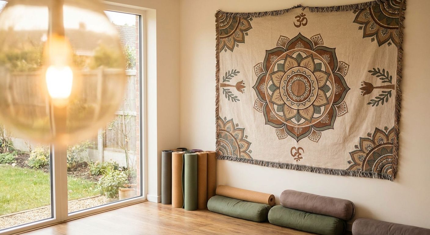
Yoga and meditation studios live or die on the mood of the room, and the wall art you hang either supports that calm or competes with it every single class.
- Yoga studio wall art works best in muted, low-contrast palettes — high-gloss black-and-white photography is the wrong call.
- Botanical prints like Tree Banksia read as nature without pulling attention from breath work — buy for calm studios.
- Hang art at 57 to 60 inches to center, so sightlines work for both seated and standing poses.
- Unframed matte canvas beats framed glass in hot-yoga rooms — condensation and glare ruin the second.
- Skip busy figurative scenes over 30x40 inches; they read as decoration, not atmosphere, once the room fills.
Why this matters
A studio wall isn't a living room wall. Students spend 45 to 90 minutes staring at the same fixed point, often from the floor, often with eyes half-closed. Any piece that's too busy, too bright, or hung too high becomes a distraction instead of a backdrop, and that's the difference between a studio that photographs well and one that actually holds a room's attention through an hour of stillness.
Gioia Wall Art stocks over 6,000 curated canvas prints, fine art prints, and framed pieces, and studio owners buying wall art for a practice space are shopping a very different brief than someone decorating a bedroom. The palette rules are tighter, the scale math is different, and the finish choice actually affects whether the room feels calm or chaotic under studio lighting.
Who this is for
This guide is for studio owners, teacher-training directors, and meditation-room designers furnishing a space where people practice for 30 minutes or longer at a stretch — hot yoga studios, restorative rooms, sound-bath spaces, and home meditation corners scaled up to studio size. If you're decorating a single home yoga nook, most of this still applies, just at a smaller footprint.
What to look for in yoga studio wall art
Muted, low-contrast color palette
High-contrast black-and-white or saturated jewel tones grab the eye fast, which is exactly wrong for a room built around slowing down. Sand, sage, dusty rose, and soft blue palettes hold attention without demanding it, letting the eye rest on the piece the same way it rests on a candle flame.
Scale that matches open floor space
Studios have long, uninterrupted walls that a single 24x36 canvas will look lost on. Match the print run to the wall — a single oversized piece (40 inches or wider) or a horizontal set of three reads intentional across a 12-foot practice wall, where a scattered gallery arrangement reads cluttered.
Matte finish over glossy or glass-framed
Hot yoga rooms run 90 to 105 degrees Fahrenheit with high humidity, and glass-framed prints fog and glare under that heat. Matte canvas with no glass absorbs studio lighting instead of bouncing it back into a student's eyeline mid-pose.
Nature and abstract themes over literal figures or text
Motivational text walls and literal yoga-pose illustrations date fast and read as gym decor, not studio atmosphere. Botanical, abstract, and soft-figure pieces age better and don't compete with the instructor's cues the way bold typography does.
Placement height built for mixed sightlines
Students view the wall from standing, seated, and floor positions within the same class, so the standard 57-to-60-inch center-of-art rule needs adjusting down for rooms where most of the practice happens seated or supine — closer to 50 inches keeps the piece in view from the mat.
Humidity-safe materials
Paper prints under glass warp and peel in studios that run a humidifier or a heater; canvas stretched over a wood frame handles temperature swings without buckling, which matters more here than in almost any other room type this brand ships to.


Top picks for the practice room
The calm anchor — Serene Striped Woman uses a soft, muted line-and-color figure study that reads as atmosphere rather than a portrait once you're six feet back on a mat. At $179.99, it works as a single statement piece on a wall up to 10 feet wide without needing a companion print. Buy for the main practice wall behind the instructor.
The safe pick — Tree Banksia is a botanical print with a limited, earthy palette that never competes with instruction cues, and botanicals are the single most reliable theme for shared practice spaces because nobody objects to a plant. Buy for reception areas and side walls where you want texture without a focal point.
The wildcard — Coral Woman Dreaming leans warmer than the other three, with a coral-and-cream palette that fits restorative or sound-bath rooms better than a high-intensity flow studio. Consider it if your space skews warm-toned already; skip it in a room with cool gray or navy walls, where the coral will fight the palette instead of complementing it.
The texture layer — Flowervase, Style D brings a still-life quality that works well paired with Tree Banksia across a longer wall, giving a studio two botanical pieces that read as a set without matching exactly. Buy as a pair, not a solo hang, since a single still-life this quiet can look sparse alone on a large wall.
For sizing any of these against your actual wall dimensions before you commit, run the numbers through the guide on choosing the right canvas size rather than eyeballing it — studio walls are almost always bigger than the standard living-room math accounts for.
“If the print pulls your eye more than your breath does, it's too busy for a mat room.”
What to avoid
- Glossy black-and-white photography over 30 inches. It photographs beautifully for Instagram and glares badly under studio track lighting during an actual class.
- Motivational typography walls. Text pieces read as gym decor within a year and date a studio faster than any image-based print will.
- Framed-under-glass pieces in hot-yoga rooms. Glass fogs at sustained heat above 90 degrees Fahrenheit and becomes a maintenance problem, not a design choice.
One color decision matters more than most studio owners expect: a warm palette in a cool-toned room (or the reverse) undercuts everything else on this list, so check the wall art color palette guide before ordering more than one piece.
Verdict comparison
| Pick | Palette | Best wall | Verdict |
|---|---|---|---|
| Serene Striped Woman | Muted, cool-neutral | Main practice wall, 8-10 ft | Buy |
| Tree Banksia | Earthy, botanical | Reception / side walls | Buy |
| Coral Woman Dreaming | Warm coral-cream | Restorative / sound-bath rooms | Consider |
| Flowervase, Style D | Soft still-life | Paired with botanicals | Buy (as a pair) |
Studios chasing a more minimalist, Japandi-adjacent look instead of the softer figurative style above should start with the Japandi wall art guide — the palette logic (low contrast, natural materials) carries over directly from bedroom to practice room.
FAQ
What is the best wall art for a yoga studio?
Muted, low-contrast botanical or soft-figure canvas prints work best for yoga studios in 2026, since they hold attention without competing with instruction. Avoid high-gloss photography and text-based motivational prints, which read as gym decor rather than atmosphere.
How high should wall art hang in a meditation room?
Hang the center of the art around 50 to 57 inches from the floor in a meditation or yoga room, lower than the standard 60-inch living-room rule. Most practice happens seated or supine, so the lower height keeps the piece in view from the mat.
Is framed or unframed canvas better for a hot yoga studio?
Unframed matte canvas is better for hot yoga studios, since glass-framed pieces fog and glare once room temperatures pass 90 degrees Fahrenheit. Matte canvas absorbs studio lighting instead of reflecting it into a student's sightline.
What size wall art fits a yoga studio wall?
A single canvas 40 inches or wider, or a set of three prints spanning most of a 10-to-12-foot wall, fits typical yoga studio proportions better than smaller framed pieces. Studio walls are longer and more open than residential walls, so undersized art tends to look scattered rather than intentional.
Should meditation rooms use color or black and white wall art?
Meditation rooms do better with soft, muted color than high-contrast black and white, since strong contrast pulls the eye and competes with breath-focused practice. Sand, sage, and dusty rose tones read as calming without adding visual noise.
Does wall art placement matter for a shared practice room?
Placement matters more in shared practice rooms than in single-use spaces, because sightlines vary between standing, seated, and floor positions within the same class. A lower center height (around 50 inches) works across all three viewing positions.
Can I mix botanical and figurative wall art in one studio?
Yes, botanical and soft-figure prints pair well in the same studio as long as the palette stays consistent, such as pairing an earthy botanical print with a muted figure study in the same tonal range. Mixing bold figurative pieces with botanicals in clashing palettes is the combination to avoid.
What wall art should I avoid in a spa-style meditation room?
Avoid saturated color, glossy finishes, and text-heavy prints in a spa-style meditation room in 2026, since all three add visual energy the room is designed to remove. Matte, low-contrast, nature-adjacent prints hold the calm the space is built around.
One last thing
The single most common mistake studio owners make isn't the print choice — it's hanging one oversized piece dead-center on the instructor's wall and leaving every other wall bare. Side and back walls get just as much eye time during floor work as the front wall does, and a smaller companion piece on a side wall, in the same palette, does more for the room's overall calm than a second large statement print ever will. Studios modeling their palette after a spa aesthetic can borrow directly from the spa-style bathroom wall art guide — the same muted, matte logic applies to a practice room built for stillness.


