
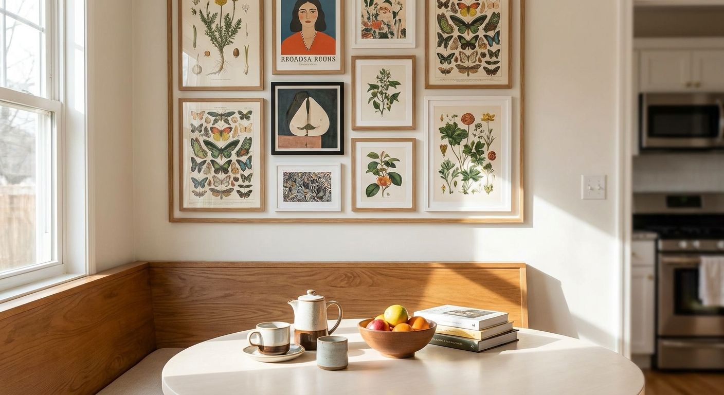
Breakfast nooks live somewhere between kitchen and dining room, which is exactly why they're so easy to decorate wrong. Wall art for breakfast nooks needs to survive steam, morning glare, and a wall that's usually smaller than you think — here's how to pick pieces that actually work in that spot.
- Bright Citrus Still Life and Daisies In Blue Teapot suit breakfast nooks because their palettes play off dishware and morning light — both Buy.
- Skip glossy metallic or gold leaf pieces near a stove or coffee station; grease and glare make them hard to keep clean in 2026 as much as any other year.
- Keep canvas art 4-6 inches above bench or banquette seating so the piece reads as its own moment, not a headrest.
- Original paintings and heirloom pieces belong farther from the cooking zone — hold those for a dining room or hallway.
Why this matters
A breakfast nook gets used every single day, usually at the exact moment you're least interested in decor decisions — that's the room that has to work without you thinking about it. Wall art for breakfast nooks that's the wrong scale, the wrong finish, or the wrong palette becomes background noise fast, or worse, a maintenance headache next to a coffee maker. Gioia Wall Art's curated collection leans into pieces that read well from a seated angle, which is a different problem than art hung at standing eye level in a hallway. If you want kitchen-specific inspiration beyond the nook itself, the flower market wall art for kitchen decor guide covers the botanical-still-life direction that works well in adjacent cooking spaces.
Who this is for
This guide is for anyone with a breakfast nook, banquette, or small eat-in kitchen corner that's been staring back at them with a blank wall for longer than they'd like to admit. It's for the homeowner who wants the space to feel finished by 2026 without a full kitchen remodel, and for renters who need something that goes up fast and comes down clean. If your nook doubles as a home-office corner during the day, some of the same sizing logic applies — that crossover audience will also find the criteria below useful.
What to look for in wall art for breakfast nooks
Size that respects the seating, not just the wall
A breakfast nook wall is almost always shorter and narrower than a standard dining room wall, so the canvas that looked perfect on a big living room mockup will overwhelm a banquette corner. Measure the actual visible wall above the bench, not the full wall height, since cabinetry or a window usually eats into it. As a general rule, leave 4-6 inches of clearance above the top of the seatback so the art doesn't read as part of the furniture.
Moisture and grease resistance
Breakfast nooks sit close to stoves, kettles, and toasters, which means steam and the occasional grease splatter are part of daily life. Canvas prints with a protective finish hold up better here than unframed paper posters, which can wave or discolor with repeated humidity exposure. If your nook is genuinely steamy — think a galley kitchen with poor ventilation — treat it like the guidance in wall art for restaurant and cafe interiors, which deals with the same commercial-kitchen-adjacent conditions.
Morning light and fade resistance
Most breakfast nooks are positioned to catch morning sun, which is great for coffee and bad for pigment. Direct, unfiltered light for hours a day will fade lower-quality prints noticeably within a couple of years. Canvas prints with UV-resistant inks handle this far better than budget posters, so if your nook faces east, prioritize canvas over paper.
A palette that plays off your dishware and linens
A breakfast nook is one of the few rooms where your art gets compared directly to place settings, mugs, and table runners every single day. Warm citrus tones, soft blues, and muted florals tend to read well against most kitchenware without fighting for attention. If your kitchen already leans into a strong palette, the guide on how to match wall art to your room's color palette walks through pulling accent colors directly from cabinetry or backsplash tile.
A theme that's food-adjacent without being literal
Still life fruit, floral arrangements, and botanical prints hit the right note in a breakfast space — they nod to the room's function without being a giant painting of eggs and bacon. Landscape or travel-themed pieces also work if you want the nook to feel like a getaway rather than a kitchen extension.
Top picks for breakfast nooks


The color-pop pick: Bright Citrus Still Life. Warm oranges and yellows sit close to a breakfast table's natural color story without leaning literal. Hang it with the standard 4-6 inch clearance above your banquette and it reads as a deliberate accent, not an afterthought. Buy if your nook gets strong morning light and you want the space to feel energized rather than moody.
The classic breakfast-room pick: Daisies In Blue Teapot. A teapot motif is about as on-the-nose as breakfast nook art gets without feeling like a kitchen theme park, and the blue-and-white palette plays well against most white or wood cabinetry. Buy for a farmhouse or cottage-style nook; consider something more abstract if your kitchen skews modern minimalist.
The warm neutral pick: Vibrant Floral Terracotta Vase. Terracotta and muted florals ground a nook that has a lot of white tile or stainless steel, adding warmth without introducing a loud color. Buy for kitchens that already lean neutral and need one grounding piece rather than a full gallery wall.
The morning-light pick: Spring Flowers and Birds. Soft, light-filled florals mirror the feel of an east-facing window, which makes this piece disappear into the mood of the room rather than compete with it. Consider it if your nook already gets strong natural light — in a dim, north-facing corner, a bolder palette will read better.
What to avoid
- Glossy metallic or gold leaf finishes near the stove. They show grease and fingerprints faster than a matte canvas, and steam leaves visible streaking that's harder to wipe clean.
- One oversized single canvas that swallows the nook. A piece sized for a living room accent wall will crowd a space built for two or four people to sit comfortably — split the wall into a smaller single piece or a tight two-piece pairing instead.
- Original paintings or heirloom-grade pieces hung directly above the cooking zone. Oil splatter and daily steam exposure are hard on delicate surfaces; save those for the dining room or hallway, and see original paintings for statement walls for where they actually belong.
If you're hanging into plaster, tile backsplash edges, or a rental wall you can't drill into freely, the steps in how to hang canvas art without damaging walls cover anchor-free options that hold up fine in a breakfast nook's lighter traffic.
Verdict comparison
| Pick | Best for | Vibe | Verdict |
|---|---|---|---|
| Bright Citrus Still Life | East-facing, sunny nooks | Warm, energetic | Buy |
| Daisies In Blue Teapot | Farmhouse or cottage kitchens | Classic, cozy | Buy |
| Vibrant Floral Terracotta Vase | Neutral, tile-heavy kitchens | Grounded, warm | Buy |
| Spring Flowers and Birds | Bright, light-filled corners | Soft, airy | Consider |
FAQ
What size wall art works best for a breakfast nook?
Most breakfast nooks need a smaller canvas than a dining room wall because the visible space above a bench is limited. Measure from the top of the seatback and leave 4-6 inches of clearance before the canvas begins, then size the piece to fill roughly two-thirds of the remaining wall width.
Is canvas or framed art better for a breakfast nook in 2026?
Canvas holds up better in a breakfast nook because it resists warping from steam and humidity better than framed paper prints under glass. Framed pieces work fine if the nook is well-ventilated and away from direct steam exposure.
How do I stop morning sun from fading wall art?
Choose canvas prints with UV-resistant inks if your nook faces east or gets several hours of direct sun daily. Rotating pieces seasonally or adding a sheer curtain also slows fading over time.
Should breakfast nook wall art match my dishware?
It doesn't need to match exactly, but pulling one or two colors from your mugs, linens, or backsplash tile keeps the space feeling coordinated. A citrus or floral still life is an easy way to echo warm kitchen tones without a literal match.
What wall art themes work in a small breakfast nook?
Still life florals, fruit compositions, and soft landscapes read well in small nook walls because they're calm without being empty. Bold graphic or oversized abstract pieces tend to overwhelm a corner built for two or four seats.
Can I hang wall art above a banquette without drilling?
Yes, canvas prints under a certain weight can go up with adhesive strips rated for wall art, which avoids drilling into tile or rental walls. Heavier framed pieces still need a proper anchor for safety.
How many pieces should I hang in a breakfast nook?
One well-sized canvas or a tight pairing of two smaller pieces usually works better than a full gallery wall in a breakfast nook. The space is small enough that a busy gallery layout competes with the table setting instead of complementing it.
One last thing
The detail that trips people up most in a breakfast nook isn't the art itself — it's hanging height. A piece centered at the standard 57-inch museum guideline will sit too high over a seated banquette, since that number assumes a standing viewer. Drop the center point down so it reads correctly from where you actually sit each morning, and the whole wall will suddenly look intentional instead of borrowed from another room.


