
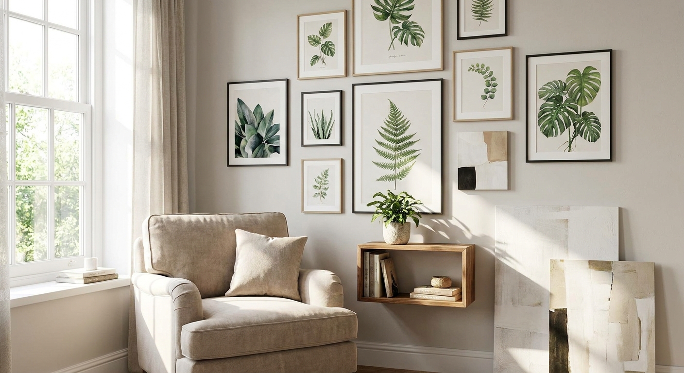
A reading nook lives or dies on mood, and the art on the wall behind your chair sets that mood before you even open the book. Pick wall art for reading nooks that competes with your page and you'll find yourself scrolling instead of reading; pick the right piece and the corner becomes the room you actually want to sit in.
- Reading nook wall art works best under 24 inches wide in corners smaller than 6x6 feet — buy small, buy calm.
- Muted, low-contrast abstracts like Gioia Wall Art's Meditation Circles B beat bold graphics for a quiet corner in 2026.
- Skip glass-framed pieces near reading lamps; glare kills the whole point of a reading nook.
- Watercolor and botanical prints outperform city skylines and portraits for sustained, low-stimulation viewing.
Why this matters
Most wall art advice is written for living rooms and entryways — big walls, big statements, lots of foot traffic to impress. A reading nook is the opposite: one chair, one lamp, one person sitting still for 20 minutes to 2 hours at a time. The art has to hold up to that kind of close, repeated, unhurried looking, which is a completely different job than a canvas hanging over a console table. Get this wrong and the nook feels like a hallway; get it right and it feels like a room you built on purpose.
Who this is for
This guide is for anyone carving a reading corner out of an existing room rather than starting with a blank wall — the armchair wedged into a bay window, the underused corner of a bedroom, the sliver of space next to a bookshelf in a small apartment. You're not decorating a whole wall; you're decorating a sightline from one seated position, which changes almost every rule about scale and placement. If you're also trying to squeeze a desk into the same corner, treat this as a starting point and adjust for that second function too.
What to look for in reading nook wall art
Scale that fits the actual footprint
Reading nooks are small by definition, and oversized canvases will make the space feel like it's apologizing for itself. A single piece between 16 and 24 inches wide is usually the ceiling for a nook under 6 feet square — anything bigger starts fighting the chair and the lamp for visual space. If your corner has a taller, narrower wall segment, a vertical orientation reads better than a wide horizontal one.
A color palette that lowers the temperature
High-saturation, high-contrast color schemes are stimulating, which is exactly what you don't want next to a reading chair. Muted blues, soft greys, warm neutrals and dusty greens keep the nervous system in the same register as a book, not a scroll session. Save the saturated color-blocking for the hallway or the entryway — a reading nook rewards restraint.
Subject matter that doesn't demand attention
A piece with a strong narrative — faces, text, busy scenes — pulls your eye back to it every few minutes, which is the opposite of what a reading corner needs. Abstract shapes, soft botanicals, and quiet geometric compositions sit in your peripheral vision without competing with the page. Portraits and quote art are better suited to entryways or above-the-sofa placements where a glance-and-move-on relationship works fine.
Glare-free framing near your reading light
Most reading nooks have a dedicated lamp, and glossy glass over a print will bounce that light straight back at you the moment you look up. Matte finishes, canvas prints without glass, or non-glare glazing solve this before it becomes an annoyance you can't quite name. If you already own a framed piece with regular glass, angle it slightly off the direct lamp line rather than dead-center behind the chair.
Sizing to your canvas rules of thumb
Before you buy anything, run the numbers against a proper canvas size guide rather than eyeballing it — nooks are unforgiving of a print that's 4 inches too wide for the available wall. As a rough anchor, the art should occupy roughly 60-75% of the width of the furniture or wall segment it sits above, which in a nook usually lands between 18 and 30 inches depending on the chair.
Top picks for 2026
The calming pick — Meditation Circles B, Portrait 2. This is a soft, circular abstract composition at $179.99, and the concentric-form structure gives your eye a resting point instead of a story to follow. It's a portrait orientation, which fits the narrow wall segments most reading nooks actually have. Buy — this is the safest, most reading-friendly choice on this list.
The textural pick — Touch02, Style B. Priced at $179.99, this abstract piece leans on tactile-looking layered forms rather than flat color blocks, which reads as interesting up close without being busy from across the room. It works well in nooks with warm wood tones or linen upholstery. Buy for a nook that already has some texture in the furniture and wants the wall to match rather than contrast.
The structured pick — Geometry, Style B. At $179.99, this one brings clean lines and a more graphic composition than the other two — it's the boldest option here, so it earns a Consider rather than an outright buy. It suits a minimalist or Japandi-leaning nook better than a soft, cottagecore one; check your existing palette before committing.
The soft-tone alternative — a watercolor piece. If none of the above match your palette, browse watercolor wall art for soft interiors — the diffused edges and gentle color washes do the same low-stimulation job as an abstract but with a warmer, more traditional feel. Consider this route if your nook leans farmhouse or cottage rather than modern.


What to avoid
- Oversized statement canvases. A 40-inch piece that looks great over a sofa will swallow a reading nook's proportions and make the chair look like an afterthought.
- Glossy glass frames next to a lamp. Even a beautiful print becomes unreadable when the lamp bounces straight off the glass into your eyeline.
- High-drama color and busy scenes. Vivid abstracts, bold typography, and crowded compositions belong in hallways and entryways, not next to a chair meant for sitting still.
Verdict comparison
| Pick | Color mood | Best for | 2026 verdict |
|---|---|---|---|
| Meditation Circles B | Soft, neutral | Any nook style | Buy |
| Touch02, Style B | Warm, textural | Wood-and-linen nooks | Buy |
| Geometry, Style B | Graphic, structured | Minimalist/Japandi nooks | Consider |
| Watercolor alternative | Diffused, gentle | Cottage/farmhouse nooks | Consider |
FAQ
What's the best wall art for a small reading nook?
A single portrait-orientation piece between 16 and 24 inches wide works best for a small reading nook in 2026. Abstract or watercolor pieces with muted color palettes read as calm rather than crowded in tight corners.
Is a canvas print or a framed print better for a reading nook?
A canvas print is usually better next to a reading lamp because it avoids the glare that glass framing creates. Framed prints still work if you use matte or non-glare glazing and angle the piece away from direct lamp light.
How high should I hang art above a reading chair?
Center the piece roughly 8 to 10 inches above the top of the chair back so it sits within a seated person's natural sightline. Hanging it at standard eye-level height, meant for a standing viewer, usually puts it too high for a reading nook.
What size wall art works for a reading nook?
Most reading nooks handle a single piece between 16 and 24 inches wide best, occupying roughly 60-75% of the width of the chair or wall segment behind it. Going larger tends to overwhelm the small footprint most nooks actually have.
Should reading nook wall art be colorful or neutral?
Neutral to muted color palettes work better in a reading nook because they lower visual stimulation instead of competing with the page. Save saturated, high-contrast pieces for higher-traffic rooms like entryways or living rooms.
Can I use a gallery wall in a reading nook?
A small gallery wall can work if the nook has enough wall space, but a single cohesive piece is usually the safer, calmer choice for a corner this size. If you do go with multiples, keep the palette tight and the total footprint under the same 60-75% width rule.
Does the frame style matter for reading nook art?
Frame style matters less than finish — matte or canvas surfaces beat glossy glass next to a reading lamp every time. Beyond that, match the frame material to whatever wood tones already exist in the chair or side table.
One last thing
The detail most people miss on reading nook wall art in 2026 isn't the print at all — it's the lamp angle. Even the calmest, most muted abstract will throw glare if the lamp sits directly across from a glazed frame, so test the seat with the lamp on before you commit to hanging height. A five-minute check with a lamp beats a second trip to rehang the piece.


