
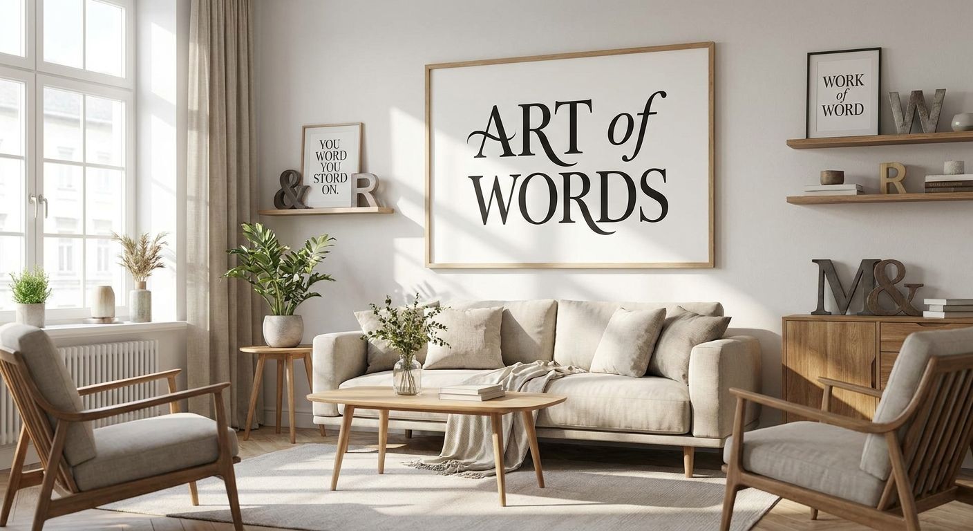
Typography wall art for modern interiors turns a single word, quote, or graphic letterform into the anchor piece of a room built on clean lines and negative space. Modern spaces run neutral by design, so the type itself has to do the work that color or pattern would do in a busier room — which means font choice, scale, and framing matter more here than in almost any other style.
- Typography wall art reads best in modern interiors with sans-serif or thin-line fonts, not ornate script.
- Size the piece to fill 60-75% of the furniture width below it, same rule as any canvas print.
- Framed typography suits home offices and entryways; unframed canvas suits bedrooms and living rooms.
- Gioia Wall Art's line art and quote collections give modern interior shoppers a hand-picked shortcut to on-trend typography in 2026.
- Two typography pieces on one wall reads as curated; three or more usually reads as clutter.
Why typography wall art matters for modern interiors
A modern room strips out ornament on purpose — no heavy trim, no busy florals, often a palette that stays within two or three neutrals. That leaves very few places for personality to live, and typography wall art is one of them. A well-placed word or short phrase gives a room a point of view without introducing a new color or a competing pattern.
The risk runs the other way, too. Pick a script font with flourishes and the piece fights the room instead of finishing it. Modern interior lovers need type that behaves like architecture: straight lines, deliberate spacing, one clear focal point. That's a narrower set of rules than most wall art categories, which is exactly why this guide exists.
Define your typography style before you shop
Start by matching the letterform to the interior style you're already living in, not the other way around. This step costs nothing and saves you from buying a print that looks wrong on the wall.
- Sans-serif block letters for Japandi and Scandinavian-leaning rooms
- Thin-line, single-weight lettering for minimalist and mid-century modern spaces
- Bold condensed type for industrial lofts with exposed brick or concrete
- Soft serif or hand-lettered script only if the room already leans modern farmhouse
- Mixed type-and-line-art pieces for rooms that want texture without adding color
If you want a shortcut past the guesswork, line art wall art for modern minimalist homes is a curated starting point built around exactly this pairing of clean type and simple linework.
Match font and color to what's already on the wall
Typography wall art only looks intentional when its color relates to something else in the room — the frame on your sofa, a throw pillow, the undertone of your paint. Pulling a color at random just adds noise.
- Pick black or charcoal type for a true neutral room with no other black accents
- Pull one accent color from existing textiles rather than introducing a new one
- Keep the background white, off-white, or matching your wall color for a built-in look
- Avoid gold or metallic text unless another metal finish already exists in the room
Size the piece to your wall, not just your eye
Undersized typography is the single most common mistake in this category — a word that reads as a whisper from across the room instead of a statement.
- Aim for the print to span 60-75% of the furniture width it hangs above
- Go larger, not smaller, when the text is a single short word rather than a full sentence
- For a gallery wall pairing, let one typography piece anchor the arrangement rather than repeating type across multiple frames
- Stand at the far end of the room before ordering — if you can't read it from there, size up
Decide between a single quote and a full word-art layout
A short phrase reads as a design statement; a paragraph-length quote reads as a poster, even on canvas. Modern interiors favor the former almost every time.
- One word or a three-to-five-word phrase for living rooms and bedrooms
- A slightly longer line works in home offices, where the reader spends more time in front of it
- Skip stacked multi-line quotes in high-traffic rooms — they're harder to read at a glance
- For workspace walls, inspirational quote wall art built for that setting balances a longer message with a still-legible layout
Choose a frame that keeps the look modern
The frame is half the design decision. A heavy ornate frame undoes clean typography just as fast as the wrong font does.
- Thin black metal or matte black wood frames for most modern rooms
- No frame at all — a stretched canvas print — for a softer, gallery-adjacent look
- Matching frame finishes across a multi-piece wall, even if the art inside varies
- White or natural wood frames for Japandi and lighter Scandinavian palettes
Before ordering, run through how to choose the right canvas size for your wall — it's the same math whether the print is a landscape or a single word.
Place typography where it earns its keep
Where you hang it changes what job the piece has to do.
- Above the sofa or bed as the room's single focal statement
- In an entryway, where a short phrase sets the tone before a guest sees the rest of the space
- Above a home office desk, in the visible zone of a video call background
- Paired with one or two art pieces of a different medium, not stacked with more type
Comparing your typography wall art options
Verdict: canvas typography wins for most modern living rooms and bedrooms; framed prints win for home offices and entryways where a finished edge matters more than a gallery-canvas look.
| Option | Best for | Key limitation |
|---|---|---|
| Canvas quote print | Bedrooms and living rooms wanting an unframed, gallery look | Text can read printed rather than hand-lettered up close |
| Framed typography print | Home offices and entryways needing a finished, ready-to-hang piece | Adds visual weight; needs a frame finish that matches nearby pieces |
| Unframed poster typography | Renters or dorm rooms testing a phrase before committing | Edges curl over time without a frame |
| Custom name or text canvas | Nurseries and gifts where personalization matters | Needs to be ordered ahead of the occasion it's for |
| Mixed type-and-line-art canvas | Japandi and minimalist rooms wanting texture without color | Harder to swap seasonally than plain text art |
“If you can't read the phrase from the far side of the room, the typography is too small for the wall.”
Common mistakes modern interior shoppers make
- Picking a phrase that's too literal. A quote that spells out exactly what the room is for reads as decor, not design — modern interiors favor suggestion over explanation.
- Using script fonts in a room with no other soft elements. Ornate lettering next to hard-edged furniture and concrete floors fights the rest of the space instead of finishing it.
- Undersizing for the wall. A small typography print above a king bed or a sectional sofa disappears instead of anchoring.
- Stacking multiple typography pieces together. One statement word or phrase per wall; a second or third piece should be a different medium, like a print or a photograph.
- Ignoring the frame color. A gold frame in an otherwise black-and-white modern room reads as an afterthought, not a choice.
FAQ
What is typography wall art?
Typography wall art is wall decor built primarily from words, letters, or a short quote rather than an image or illustration. In modern interiors, it typically uses a single clean font rather than decorative script.
Is typography wall art good for modern interiors?
Yes, typography wall art suits modern interiors because it adds personality without introducing a new color or pattern into an already neutral room. Sans-serif or thin-line lettering reads as intentional design rather than clutter.
Should typography wall art be framed or unframed?
Framed typography suits finished spaces like home offices and entryways, while unframed canvas suits bedrooms and living rooms going for a softer, gallery-canvas look. The choice depends on how much visual weight the room can take.
What size typography wall art works for a living room?
Size the piece to span 60-75% of the width of the furniture it hangs above, the same rule used for any canvas print. A short single word can go larger than that rule suggests since it needs to read clearly from across the room.
Does typography wall art work in a Japandi or minimalist bedroom?
Yes, thin-line or single-weight sans-serif typography fits Japandi and minimalist bedrooms particularly well since the style already favors restraint over ornament. Avoid script fonts and metallic text unless another metal finish already appears in the room.
How do I pair typography wall art on a gallery wall?
Let one typography piece anchor the arrangement and fill the rest with a different medium, such as photography or line art, rather than repeating text across several frames. Matching frame finishes across the pieces keeps the wall looking planned.
Is word art out of style in 2026?
Word art isn't out of style in 2026, but the ornate script and stacked-phrase versions common a decade ago have given way to cleaner single-word or short-phrase pieces in modern homes. The shift is toward restraint, not away from typography itself.
What font style works best for modern typography wall art?
Sans-serif block letters or thin single-weight lines work best for most modern interiors, since they read as architecture rather than decoration. Reserve softer serif or hand-lettered fonts for rooms that already lean modern farmhouse rather than strict minimalist.
One last thing
The rooms where typography wall art fails hardest aren't the busy ones — they're the empty ones. A single oversized word on an otherwise bare wall in a modern room with no other texture or furniture nearby ends up looking unfinished rather than minimal. Give the typography at least one other element in the room to relate to — a rug, a lamp, a stack of books — before you decide the wall is done.


