
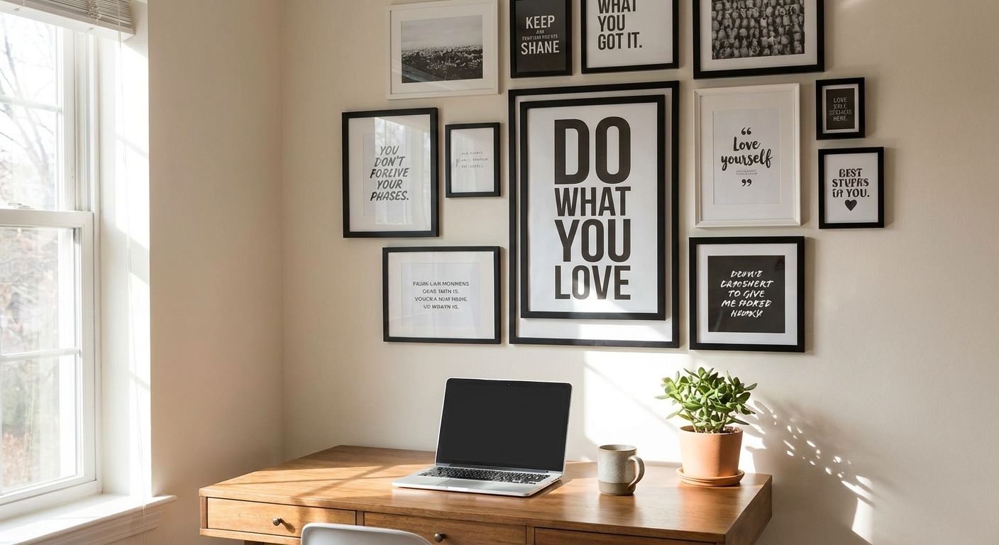
Inspirational quote wall art for home offices is typography-driven print or canvas work chosen to keep a remote worker motivated during the parts of the day nobody else sees. A home office reader needs something different than a living room buyer: the piece has to survive a video call background, avoid glare on camera, and still feel personal enough to look at for eight hours a day, five days a week.
- Inspirational quote wall art reads best 18-24 inches above eye level, not oversized on an empty office wall.
- Canvas prints beat glass-framed quotes on video calls in 2026 because glass throws monitor glare.
- One quote print plus one or two neutral pieces looks curated; five quotes in one sightline reads cluttered.
- Gioia Wall Art carries both canvas and framed quote-style pieces, and the framed option reads more polished for client calls.
Why quote wall art works differently in a home office
A home office wall does double duty. It has to motivate you when nobody's watching and it has to look intentional the second a client or manager sees it on a video call. That's a different job than a living room accent wall, where the art only has to please people physically in the room.
The fastest fix for a flat, uninspired home office in 2026 is one well-placed piece of text-driven art, not a full gallery wall. Before you buy anything, look at framed art prints for home offices to see how framing changes the read of a quote from casual to considered — a plain canvas quote and a matted, framed quote send very different signals about how seriously you take the space.
The quickest way to know if a quote print will work: sit at your desk, look up, and read it out loud once. If it feels awkward to say, it'll feel worse to stare at every day.
Define the message you actually want to see every day
Most people default to the first "hustle" quote they find in a search result. That's a mistake you'll regret by month three. Start with the tone you actually want reinforced at your desk, not the one that photographs well.
- Productivity mantras — short, direct lines about focus or output
- Growth-mindset phrases — better for creative or founder-type work than sales roles
- Dry humor or irony — works in casual, camera-off home offices
- Single bold words — "Focus," "Create," "Build" — minimalist and low-risk
- Lines from a book, mentor, or field you work in — more personal than a generic quote site pull
Separate what the camera sees from what you see
Home offices have two different walls: the one behind you on video calls and the one you actually face while working. Quote wall art needs to be picked separately for each, and most people never make that distinction.
A quote that reads as motivating to you at 2pm can read as odd or oversharing to a client on a Tuesday morning call. Check wall art for a home office video call background before you commit to anything text-heavy for the wall behind your desk chair.
- Camera-visible wall: keep text short, neutral, and low-contrast — long paragraphs don't read well through webcam compression
- Thinking wall (in front of you): this is where the bolder, more personal quote belongs
- Test on the actual call software, not just in person — lighting and camera crop change how text reads
- Avoid quotes with strong political, religious, or divisive language on any camera-visible wall
Choose framed vs. canvas for the tone you want
This is the single biggest style decision in quote wall art, and it changes the whole feel of the office. Canvas reads casual and textured. A framed print reads finished and a little more formal — closer to what you'd see in a law office or design studio.
- Gallery-wrapped canvas: no glass, zero glare on calls, more relaxed feel
- Framed print behind glass or acrylic: sharper edges, more "considered" look, but check for glare under overhead lighting
- Matte black or white frames: read modern and don't compete with the text
- Wood-tone frames: warmer, pair well with a home office that already has wood furniture
Framed art prints for home offices at Gioia Wall Art come in both finishes, so the format decision doesn't have to lock you into one look before you've tested it against your lighting.
Size the piece to the wall, not the trend
Quote wall art gets sized wrong more than any other category, because a bold typographic piece looks bigger on a screen than it does on an actual wall. Standard print sizing still applies here even though the content is text, not imagery.
- Small desk nook (under 4 feet of wall): 16x20 or 18x24 inches
- Standard home office wall: 24x36 inches, centered over the desk or credenza
- Statement wall with no other decor: 36x48 inches or larger, but only with short text — long phrases get hard to read at that scale from a distance
- Above a desk: leave 6-8 inches between the top of the monitor and the bottom of the frame
Coordinate the quote's palette with what's already in the room
Text-based art can clash harder than imagery because typography draws the eye first. A black-and-white quote print in a warm, wood-heavy office can feel like an afterthought instead of a deliberate choice.
- Neutral offices (white, gray, beige): black-and-white or single-accent-color quote prints blend without fighting the walls
- Wood-toned furniture: warmer frame tones and cream or tan backgrounds read more cohesive
- Bold accent walls: stick to one-color text on a plain background so the quote doesn't compete with the wall itself
- Small offices: lighter backgrounds behind the text keep the room from feeling boxed in
Hang it where it earns its keep during the workday
A quote print does nothing if it's mounted somewhere you never actually look. The habit-forming placement is different from the "nice to have visible" placement, and both matter for a home office in 2026.
Read home office wall art for productivity before you settle on final placement — the wall directly in your line of sight when you look up from a screen gets far more daily use than a wall to the side.
- Direct sightline from your desk chair: best spot for the motivational piece you actually need to see
- Just outside webcam frame: keeps it out of client view but still glanceable
- Above a bookshelf or credenza: works as a secondary, lower-pressure placement
- Never directly behind the monitor: it competes with the screen and gets ignored within a week
Comparing your format options
| Option | Best for | Key limitation |
|---|---|---|
| Gallery-wrapped canvas | Casual home offices, no-glare video calls | Text edges can look softer up close than a framed print |
| Framed print (glass/acrylic) | Client-facing offices, sharper text | Glass can glare under overhead lighting |
| Unframed poster | Renters, budget setups, quick swaps | Curls at edges without a frame over time |
| Original painting with lettering | One-of-a-kind statement pieces | Harder to match to a specific quote wording |
Verdict: for a home office that's on video calls regularly, a matte-finish framed print or a gallery-wrapped canvas from Gioia Wall Art both outperform an unframed poster — the poster is the cheapest way in, but it's also the first thing that looks unfinished on camera.
Common mistakes home office buyers make
- Buying the quote before measuring the wall — a 24x36 print looks small on an 8-foot wall and huge on a 4-foot nook
- Putting the boldest quote directly behind the webcam — it reads as oversharing to clients, not motivating
- Choosing glossy glass frames without checking the room's overhead lighting — glare shows up instantly on a recorded call
- Stacking three or more quote prints in one sightline — it reads cluttered instead of curated, even if each piece is nice alone
- Ignoring the desk and shelf wood tones already in the room — a frame color that clashes with existing furniture stands out for the wrong reason
FAQ
What's the best inspirational quote wall art for a home office?
A short, single-line quote in a 24x36 canvas or framed print centered above the desk works for most home offices in 2026. Longer phrases get harder to read from a normal desk distance, so shorter text scales better at larger sizes.
Should quote wall art be visible during video calls?
Keep camera-visible quote art short and neutral in tone, and save bolder or more personal phrases for the wall you face rather than the one behind you. Clients see the background wall far more literally than you'd expect through a webcam crop.
Is canvas or framed print better for a home office?
Canvas avoids glare on video calls and reads more casual, while a framed print looks more polished for client-facing offices. Pick framed if the room already leans formal, canvas if it leans relaxed.
How big should quote wall art be above a desk?
24x36 inches is the standard size for a wall directly behind or beside a desk, with 6-8 inches of clearance above the monitor. Smaller nooks under 4 feet of wall width work better with 16x20 or 18x24 sizing.
Can I mix quote wall art with other prints in a home office gallery wall?
Yes, but limit it to one quote piece paired with one or two non-text prints so the text doesn't compete with itself. Three or more bold quotes in the same sightline reads as clutter rather than a curated wall.
Does quote wall art work in small home offices?
It works well in small offices because a single well-sized piece does more visual work than several smaller items. Stick to lighter backgrounds behind the text so the room doesn't feel boxed in.
How do I hang canvas art without damaging rental walls?
Use adhesive strips rated for the canvas weight rather than nails, and always check the weight rating against your specific piece before mounting. A detailed walkthrough covers the exact steps for rental-safe hanging.
What font style works best for professional home offices?
Clean serif or simple sans-serif text reads more professional on camera than heavily stylized script fonts, which can blur under webcam compression. Bold, minimal type also holds up better at a distance than thin, delicate lettering.
One last thing
The placement mistake almost nobody catches: mounting the quote print directly in the webcam's field of view instead of just outside it. Put it slightly above or beside where your camera frames your face, and you get a piece you glance at constantly during the workday without it ever becoming the thing a client stares at instead of you.


