
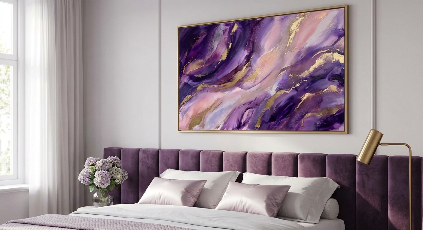
Purple and violet wall art brings a mood that beige abstracts never will: rich, saturated, a little theatrical, exactly what a glam bedroom needs. If you're hunting for pink and purple art that reads expensive instead of Halloween-costume-purple, the difference comes down to undertone, scale, and framing, not just the color itself.
- Deep violet abstracts over the bed win for glam bedrooms in 2026 - buy at 40x60 inches minimum for a queen or king.
- Pink and purple art with warm plum or magenta undertones reads richer under 2700K bulbs than cool lavender does.
- Pairing violet with emerald or forest green is the 2026 jewel-tone move for a glam-meets-moody bedroom.
- Skip pastel lavender prints under 16x20 inches - they wash out against dark accent walls and read as an afterthought.
Why this matters
Purple has a branding problem. Say "purple wall art" and a lot of shoppers picture pastel lilac nurseries or a teenager's dorm poster, not a bedroom that could sit in a design magazine. The gap between those two outcomes is almost entirely about undertone and how the piece is framed. Matching wall art to your room's color palette is the step most people skip, and it's the one that determines whether your violet print looks intentional or accidental.
2026 bedroom trends lean into jewel tones over the muted greige everyone was doing five years ago. Violet, plum, and magenta are having a real moment specifically because they photograph well against brass hardware and velvet headboards - the two things glam bedrooms are built on.
Who this is for
This guide is for anyone furnishing a bedroom around drama rather than restraint - velvet headboard, brass sconces, maybe a mirrored nightstand - who wants the wall art to carry the same energy instead of defaulting to a safe neutral abstract. It's also for shoppers specifically searching pink and purple art for a space that needs warmth and richness, not a cool, minimalist palette.
What to look for in purple and violet wall art for glam bedrooms
Undertone: violet versus lavender versus magenta-pink
True violet leans blue-red and holds its saturation in daylight and lamp light alike. Lavender is violet diluted with gray, which is why it looks moody in a showroom photo and flat once it's on your actual wall. If the piece reads gray under a 2700K bulb, it's lavender, not violet - test that before you buy, not after.
Metallic accents and finish
Glam rooms lean on brass, gold, and mirrored surfaces, so wall art with a metallic ink accent or a gold-leaf frame edge pulls double duty. A flat matte print in a plain black frame can look almost austere next to a velvet headboard - not wrong, just a different mood than glam is going for.
Scale relative to the bed wall
A single print under 16x20 inches disappears above a queen or king headboard; it reads like an afterthought rather than a statement. The general rule is two-thirds the width of the headboard, which usually lands somewhere between 40x60 and 48x60 inches for a queen bed.
Framed versus unframed canvas
Framed prints read more "finished" and more glam by default, especially with a brushed gold or black-and-gold frame. Gallery-wrapped canvas without a frame leans more casual-modern, which can undercut the drama you're going for in a glam room.
Coordinating with bedding and accent colors
Violet paired with blush or rose-pink bedding is the classic pink and purple art combination, and it works because the two sit close together on the color wheel - low risk, high payoff. Violet paired with emerald or deep forest green is bolder and reads more "jewel box" than "soft romance," so pick based on which mood you're actually building.
Lighting temperature
Warm bulbs (2700K-3000K) intensify red-violet and plum tones; cool white bulbs (4000K+) flatten them toward gray. If your bedroom runs cool-white overhead lighting, a warm plum print can look almost brown at night - swap the bulb before you blame the art.
Top picks for glam bedrooms
The safe pick: a deep violet abstract above the bed. Look for a single large-scale canvas at 40x60 inches or bigger with warm plum or aubergine tones rather than cool lavender - it anchors a queen or king headboard without competing with a velvet frame. The wall art for above the bed guide covers exact sizing by bed width if you're between two options. Verdict: Buy.
The wildcard: a magenta-and-plum eclectic gallery arrangement. Six to eight smaller framed pieces in mixed magenta, plum, and blush tones, spaced two to three inches apart, gives a glam bedroom a maximalist edge without one oversized purple canvas dominating the room. The maximalist eclectic wall art approach works especially well if your bedroom already has pattern in the rug or bedding. Verdict: Consider.
The jewel-tone pairing: violet against emerald or forest green. This is the boldest of the four picks and the one most aligned with 2026's moody-luxury direction - violet and green sit as near-complements on the color wheel, so the contrast reads intentional rather than clashing. The jewel-toned wall art guide breaks down how much green to bring in before it fights the purple for attention. Verdict: Buy.
The quiet-luxury pick: a single lavender-grey abstract in a brushed-gold frame. This is the muted option for anyone who wants a hint of violet without full jewel-tone saturation - a 48-inch canvas with soft grey-lavender tones and a warm gold frame edge. It reads more "quiet luxury" than "glam drama," which is the right call if your bedroom is already busy with texture. Verdict: Consider.
What to avoid
- Cool pastel lavender marketed as "purple." It photographs fine in a product shot but goes flat and gray in real room lighting - the opposite of the richness a glam bedroom is chasing.
- Undersized prints on a large headboard wall. Anything under 16x20 inches on a queen or king wall looks like it was left over from a smaller room, not chosen for this one.
- Mismatched metal tones. A silver-frame purple print next to brass sconces and gold hardware is the most common styling miss in glam bedrooms - pick one metal finish and repeat it in the frame.
“If the piece reads gray in daylight, it's lavender, not violet, and lavender fades into a glam room instead of anchoring it.”
Verdict comparison
| Style | Undertone | Best wall | Minimum size | Verdict |
|---|---|---|---|---|
| The safe pick | Deep violet / aubergine | Above the bed | 40x60 in | Buy |
| The wildcard | Magenta and plum mix | Gallery wall | 6-8 pieces | Consider |
| The jewel-tone pairing | Violet + emerald | Accent or feature wall | 40x60 in | Buy |
| The quiet-luxury pick | Lavender-grey | Above dresser or bench | 48 in | Consider |
FAQ
What's the best pink and purple art for a glam bedroom?
A large-scale abstract in deep violet or plum with a warm-metallic frame edge works best - it holds saturation under lamp light instead of fading gray like pastel lavender does. In 2026, pairing it with blush or rose bedding is the most requested combination in glam bedroom styling.
Is purple wall art too bold for a small bedroom?
No, but scale matters more in a small room, not less - one well-sized violet piece reads intentional while several small purple prints scattered around can make a small bedroom feel busy. Stick to one statement piece and keep the rest of the palette neutral.
Does purple wall art work with gray or beige walls?
Yes, and it's actually the easiest background for it - neutral walls let violet and plum tones carry all the color impact in the room. Warm greige backgrounds intensify plum undertones more than a stark white wall does.
What size purple canvas do I need above a queen bed?
Aim for roughly two-thirds the width of the headboard, which usually lands between 40x60 and 48x60 inches for a queen bed in 2026 standard bedroom layouts. Going smaller makes the piece look like an afterthought against the headboard.
What colors pair best with violet wall art?
Blush and rose-pink create a soft, romantic pairing since they sit close on the color wheel, while emerald or forest green create a bolder, jewel-toned contrast. Gold or brass frame accents work with either pairing.
Should I choose framed or unframed purple canvas art?
Framed prints, especially with a gold or black-and-gold frame, read more finished and more glam than an unframed gallery-wrapped canvas. Unframed canvas leans more casual-modern, which works against the drama a glam bedroom is going for.
Why does my purple wall art look gray instead of rich?
It's likely a cool-white bulb (4000K or higher) flattening the red undertone out of the violet. Switch to a warm 2700K-3000K bulb and the same print will read plum or aubergine instead of gray.
One last thing
The fastest fix for flat-looking purple wall art isn't a different print, it's the bulb. Swapping a 4000K overhead for a warm 2700K bulb makes the exact same violet canvas read plum and rich instead of gray and washed out, and it costs less than any print you'd buy to solve the same problem.


