
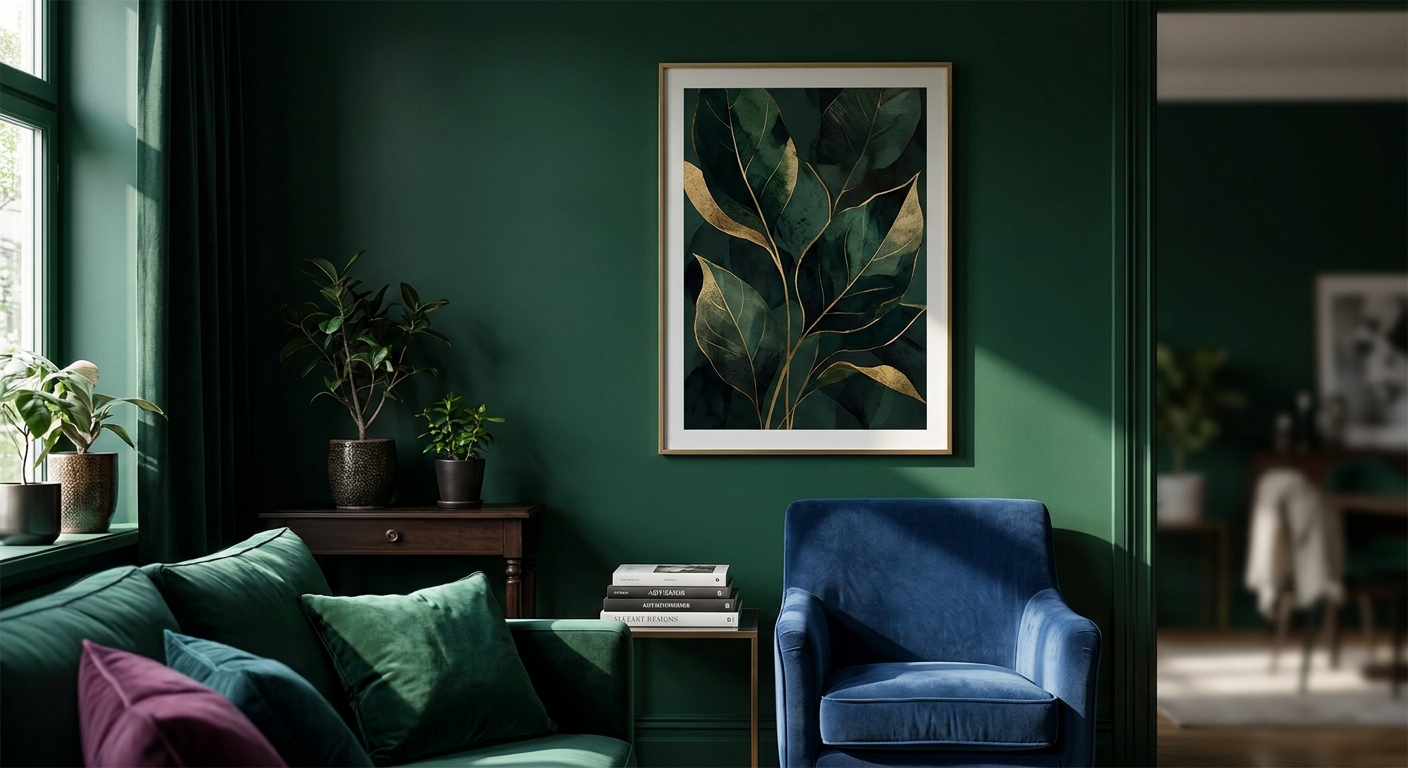
Dark green wall art is the fastest way to make a room feel like a jewel box instead of a blank box, and 2026's shift toward saturated, moody palettes has emerald, forest, and hunter-green prints selling out faster than any other colorway at Gioia Wall Art this year.
- Dark green wall art reads best oversized above a sofa or on a single accent wall in 2026.
- Emerald and forest tones need warm frame finishes like brass or walnut, not cool silver or white.
- Skip neon or teal-leaning greens for moody rooms - they read cold, not jewel-toned.
- A canvas under 16x20in gets lost against a dark green wall; go bigger than instinct says.
Why this matters
A moody, jewel-toned room lives or dies on contrast and undertone, not just on picking "green." Paint a wall hunter green and hang a print with the wrong warmth or the wrong scale, and the whole room reads muddy instead of rich. Get the undertone, finish, and size right, and dark green wall art becomes the one piece that makes the whole room look designed on purpose, not decorated by accident.
Who this is for
This guide is for anyone who's already committed to a deep green paint color, dark green furniture, or a jewel-toned mood board and now needs the art to match without looking like it came from a different house. It's for the interior lover leaning into Coastal Luxe drama, moody dining rooms, or a velvet-and-brass living room, not the person who wants a single mint accent pillow. If your palette skews soft sage or pastel, matching wall art to your room's color palette is the better starting point before you commit to anything this saturated.
What to look for in dark green wall art for jewel-toned rooms
Undertone: blue-emerald vs. warm olive
Green splits into two camps and mixing them is the number one reason a "dark green" room looks off. Blue-based emerald and forest greens pair with brass, navy, and black; warm olive and khaki-greens pair with terracotta, rust, and warm wood. Pick one lane per room in 2026 and stay in it, because a cool emerald print next to warm olive furniture reads as a mistake, not a mix.
Frame finish and metal tone
Jewel tones are saturated by nature, so a cheap glossy plastic frame or a cold chrome edge flattens the effect instantly. Brass, aged gold, and dark walnut frames add the warmth that makes deep green feel luxe instead of heavy. A framed piece with a brushed-brass edge next to a dark green wall does more visual work than a bare canvas ever will.
Scale relative to the wall color
Dark walls absorb light and swallow small art, full stop. A print that looked perfectly sized on a white wall can vanish against hunter green paint, so the standard sizing math needs to go up one full tier. If you're new to this math, choosing the right canvas size for your wall walks through the room-to-art ratio in detail.
Room lighting and finish sheen
Jewel-toned rooms often run darker overall, so a matte fine art print reads richer under warm bulbs while a glossy poster finish can bounce glare and wash out the depth of the color. In a north-facing room with limited daylight, matte canvas holds its saturation; in a bright south-facing room, either finish works.
Subject matter that earns the drama
Botanical prints, abstract brushwork, and moody landscapes carry a dark green palette better than busy geometric patterns or pastel florals, which fight the saturation instead of supporting it. A single, confident subject reads intentional; three competing subjects in a gallery cluster reads chaotic.
Top picks for dark green, jewel-toned rooms
The safe pick: statement-size canvas for the main wall. Go 36x48 inches or larger when the wall itself is painted or papered in a deep green - anything smaller disappears into the color field around it. Extra-large canvas wall art for statement walls is built exactly for this scale problem. Verdict: Buy for any room where the wall color itself is the dark green.
The versatile pick: above-the-sofa anchor piece. Center the art 6 to 12 inches above the sofa back and keep the width at roughly two-thirds of the sofa's length - a common decor rule that still holds in 2026 regardless of color palette. Wall art for above the sofa covers the placement math if the sofa itself is the dark green anchor and the art needs to complement rather than compete. Verdict: Buy if your sofa or rug already carries the jewel tone.
The bold pick: single accent wall focal print. This works when only one wall goes dark and the rest of the room stays neutral, letting one saturated print do all the color work. Wall art for accent walls is the right reference for pairing scale and frame choice to a single feature wall. Verdict: Consider - it's the highest-impact option but only if the rest of the room can stay quiet enough to support it.
What to avoid
- Neon or teal-shifted green. It photographs well on a screen but reads cold and cheap next to brass hardware or velvet upholstery - not jewel-toned, just bright.
- Undersized prints on dark walls. A 12x16 print that looked fine on a white wall gets visually swallowed the moment the wall behind it goes hunter green.
- Cool-toned frames on warm olive greens. Silver or chrome frames fight a warm undertone instead of grounding it; save those finishes for blue-emerald palettes only.
“If the print gets lost the moment you paint the wall dark, the print was always too small for the room.”
Verdict comparison
| Pick | Best for | Frame tone | Verdict |
|---|---|---|---|
| Statement-size canvas | Dark green painted walls | Brass or walnut | Buy |
| Above-the-sofa anchor | Green sofa or rug already in place | Warm wood, black | Buy |
| Single accent wall focal | One feature wall, rest neutral | Aged gold | Consider |
FAQ
What is the best dark green wall art for a small room?
A single, confident piece in the 18x24 to 24x36 inch range works best in a small room - a cluster of smaller dark green prints tends to make the walls feel like they're closing in. One larger print reads more open than three small ones in the same square footage.
Does dark green wall art work with black frames?
Yes, black frames pair well with cooler, blue-based emerald tones and give the room a more graphic, modern edge. For warmer olive greens, a walnut or brass frame usually reads more cohesive than black.
Is emerald or forest green better for a moody bedroom?
Forest green tends to read calmer and more restful for a bedroom, while emerald leans more dramatic and works better in living and dining spaces. Both qualify as jewel tones, so the choice comes down to how much drama the room can hold at night under lamp light.
How big should dark green wall art be above a sofa?
The art should span roughly two-thirds the width of the sofa and sit 6 to 12 inches above the back cushions in 2026's standard sizing guidance. For a sofa around 84 inches wide, that puts the ideal art width in the 48 to 60 inch range.
What colors pair with dark green wall art in a jewel-toned room?
Brass, navy, deep plum, and warm wood tones all pair naturally with dark green in a jewel-toned scheme. Avoid pairing it with pastel accents, which flatten the saturation instead of deepening it.
Can dark green wall art work in a small apartment?
Yes, but scale and wall coverage matter more in a small space - one saturated statement piece works better than several competing prints. Check sizing guidance for tight layouts before committing to a large-format piece.
Is dark green wall art still trending in 2026?
Yes, saturated jewel tones including dark green and emerald remain one of the strongest color stories in home decor through 2026, driven by demand for moodier, richer interiors over the flat neutrals popular in prior years.
One last thing
The detail most people skip: dark green wall art looks noticeably different under warm 2700K bulbs versus cool 4000K daylight bulbs, and the difference is bigger than with almost any other color. Before you commit to a print for a moody, jewel-toned room, look at it under the actual bulb you'll be using at night - not the store's overhead lighting or a phone screen, which both tend to cool the green down and mute the drama you're paying for.


