
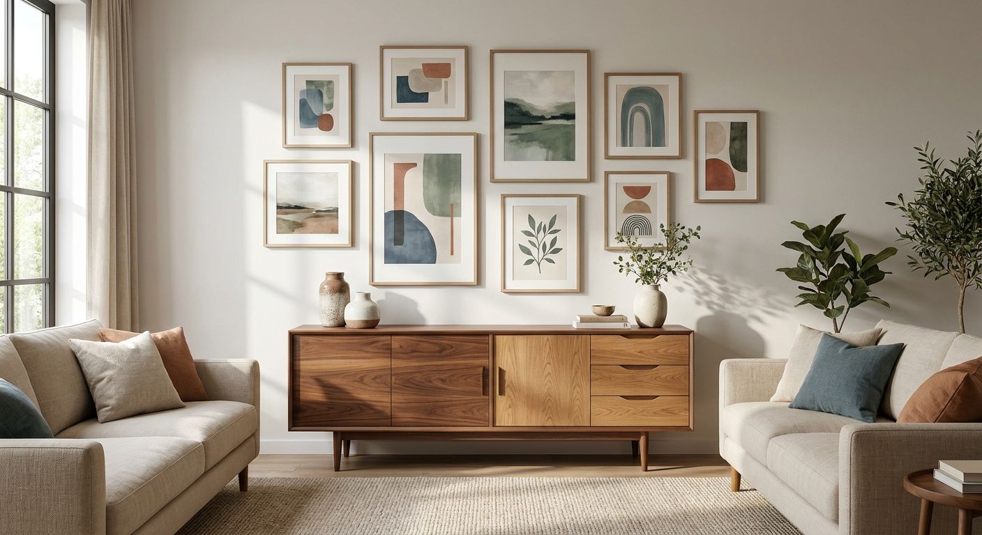
Wood furniture sets the color temperature of a room before a single piece of art goes on the wall, and picking a print that fights that temperature is the fastest way to make a well-furnished space feel off. This guide walks through matching wall art to wood furniture tones step by step, from reading your wood's undertone to testing the final placement.
- Identify whether your wood furniture leans warm, cool or neutral before choosing wall art to match wood furniture tones.
- Warm woods like honey oak and walnut pair best with terracotta, rust, mustard and olive palettes.
- Cool or grey-toned wood pairs best with blues, sage green, charcoal and black-and-white prints.
- Contrast matters more than color match: dark furniture needs lighter art, light furniture can handle deeper tones.
- Gioia Wall Art's 2026 catalog spans warm and cool palettes so you can shop by undertone, not guesswork.
Why this matters
A room reads as "put together" when the wood, the wall color and the art share a consistent temperature, and it reads as mismatched when they don't, even if every individual piece is beautiful on its own. Most people shop for wall art by subject matter first and color second, which is backwards when wood furniture is the dominant material in the room. Get the undertone match right in 2026 and the print looks like it was chosen for the space; get it wrong and it looks like it wandered in from a different house.
The good news is that wood undertone is easier to read than most interior variables. Once you know what you're looking at, matching wall art to wood furniture tones becomes a five-minute decision instead of a guessing game, and this guide's color palette breakdown walks through the undertone logic in more depth if you want a deeper reference after finishing here.
What you'll need
- A clear afternoon-light photo of your wood furniture (natural light shows undertone more honestly than lamp light)
- A rough measurement of the wall space you're filling
- Swatches or photos of your existing wall color and any large upholstered pieces
- A shortlist of 3-4 wall art candidates in different palettes to compare side by side
- A tape measure and painter's tape for the placement test in step 8
The steps
1. Identify your wood's undertone
This is the step everything else depends on, so don't skip it. Hold a white sheet of paper next to the furniture in daylight: if the wood looks pink, orange or golden next to the white, it's warm; if it looks grey, ashy or slightly purple, it's cool. Oak, pine, cherry and most reclaimed farmhouse wood run warm. Grey-washed oak, ash and driftwood finishes run cool.
Common mistake: judging undertone under warm indoor lighting, which pushes almost every wood toward orange and makes cool-toned pieces look warm.
2. Name the actual color story, not just "brown"
Wood is never just brown. Walnut carries deep red-brown and near-black grain. Honey oak carries yellow-gold. Espresso finishes lean toward true black-brown. Write down the two or three colors you actually see in the grain, because those are the colors your wall art needs to speak to.
Common mistake: treating all wood furniture as one neutral category, which leads to art that clashes with the specific red or gold undertone in the grain.
3. Match warm woods to warm-leaning palettes
Honey oak, cherry, pine and most farmhouse wood pair naturally with terracotta, rust, mustard, olive and warm cream palettes. A still life or landscape print with those tones will feel connected to the furniture instead of sitting on top of it. This is the palette logic behind farmhouse wall art for country interiors, which leans into exactly this warm-wood pairing.
Common mistake: choosing cool blues or icy pastels for a room full of golden oak, which flattens the warmth instead of complementing it.
4. Match cool or grey woods to cool-leaning palettes
Grey-washed oak, ash, driftwood and most Scandinavian-style furniture pair best with sage green, navy, charcoal, muted blues and black-and-white photography. These woods actually clash with heavy orange or rust tones, which read as too warm against the ash grain. Mid-century teak sits in a slightly different category here since its warmth is lower and its lines are cleaner, which is why mid-century modern wall art tends to favor muted, graphic palettes over saturated warm tones.
Common mistake: assuming all wood needs warm art. Grey and ash-toned pieces almost always look better with a cooler or more neutral palette.
5. Set the contrast level, not just the color
Dark wood furniture, like espresso or walnut, needs wall art with enough lightness or brightness to avoid a heavy, closed-in feeling. Light wood furniture, like natural pine or light oak, can handle deeper, richer tones without disappearing. As a working rule, aim for at least one strong value contrast between your darkest wood piece and your lightest wall art tone.
Common mistake: hanging a dark, moody print above dark walnut furniture, which reads as muddy rather than intentional in most lighting.
6. Check the piece under your room's actual lighting
Color temperature bulbs (warm white around 2700K versus daylight around 5000K) shift how both wood and art read on the wall. A print that looks perfectly matched on a laptop screen can look noticeably off once it's under your living room's warm-white bulbs. Preview candidates in the room itself, ideally at the time of day you use that room most.
Common mistake: finalizing a choice based on a product photo taken in different lighting than your own home.
7. Pick a frame finish that echoes or intentionally contrasts the wood
A frame finish close to the wood tone creates a quiet, cohesive look; a deliberately contrasting frame, like black metal against honey oak, creates a graphic accent instead. Both work in 2026 interiors, but pick one on purpose rather than defaulting to whatever finish happens to be in stock.
Common mistake: mixing three or more different frame finishes in one sightline along with the furniture, which fragments the room instead of unifying it.
8. Run a placement test before you commit
Tape a paper cutout the size of your chosen canvas to the wall and live with it for 24-48 hours. Walk past it at different times of day and in different lighting. If it still feels right after two days, order it; if something nags at you, that's usually the undertone or contrast talking. For sizing guidance specifically, the canvas size guide covers proportion rules relative to furniture width.
Common mistake: skipping the paper test and discovering the scale is wrong only after the art is already on the wall.


Troubleshooting
- The art looks washed out against light oak. Increase contrast by choosing a print with a darker background or richer saturation; light wood needs a print with more visual weight to hold its own.
- Everything feels like one brown blur. Introduce a color that isn't in the wood at all, like sage green or dusty blue, to break the monochrome and give the eye somewhere else to land.
- The frame clashes with the furniture. Swap to a frame finish that either closely matches the wood tone or goes fully opposite (black or white); a finish that's almost-but-not-quite the same tone reads as a mistake.
- The print picks the wrong undertone. If a warm-leaning print looks orange or muddy against cool grey wood, it's an undertone mismatch, not a color mismatch, and swapping to a cooler palette usually fixes it immediately.
- The room has two different wood tones. Pick the dominant piece by size, usually the largest furniture item, and match the art to that tone; smaller secondary wood pieces don't need to match as precisely.
- The art disappears against the wall color. This is a wall-and-art contrast problem, separate from the wood issue; recheck the piece against the wall alone before blaming the furniture.
Tools and resources
- Color palette matching guide for a deeper breakdown of undertone theory
- Canvas size guide for proportion relative to furniture width
- Hanging guide for install method once the piece is chosen
- A white sheet of paper for the undertone test in step 1
- Painter's tape and paper cutouts for the placement test in step 8
What to do next
Once the undertone and contrast rules feel intuitive, the next decision is scale: how big a canvas your specific wall and furniture arrangement can carry without looking cramped or lost. That's a separate calculation from color, and it's worth working through before you order anything for 2026.
FAQ
What color wall art goes with wood furniture?
It depends on the wood's undertone: warm woods like honey oak or cherry pair with terracotta, rust, mustard and olive tones, while cool or grey-washed wood pairs with sage green, navy and black-and-white palettes. Matching undertone, not just shade of brown, is what makes the pairing work.
Is black and white wall art better with dark or light wood furniture?
Black and white wall art works with both, but it reads especially well against light or cool-toned wood, since the neutral palette avoids competing with the furniture's own color. Against dark walnut or espresso, choose a print with enough white space to keep the wall from feeling heavy.
How do I know if my wood furniture is warm or cool toned?
Hold a plain white sheet of paper next to the furniture in daylight; if the wood looks orange, pink or golden it's warm, and if it looks grey or ashy it's cool. Testing under natural daylight matters, since warm indoor bulbs push almost any wood toward orange.
Can I mix warm and cool wall art in the same room as my wood furniture?
You can, but the dominant piece of furniture in the room should set the palette direction for the largest or most prominent wall art. Smaller accents in the opposite temperature can work as intentional contrast, but too many mixed-undertone pieces will make the room feel unresolved.
Does frame color matter as much as the art's color palette?
Yes, frame finish is part of the wood-matching equation, not separate from it. A frame close to the furniture's tone creates cohesion, while a strongly contrasting frame like black metal on light oak creates an intentional accent.
What wall art works with mid-century teak furniture?
Mid-century teak pairs best with muted, graphic palettes rather than saturated warm tones, since teak's warmth is lower than oak or cherry. Abstract or line-art prints with restrained color tend to complement teak's clean lines more than busy florals do.
How much does wall art typically cost in 2026?
Pricing varies by size, medium and framing, and it's worth checking current listings directly since ranges shift by collection. Canvas prints and framed options are priced individually on the product page.
Should wall art match the wood or match the wall color?
Wood furniture should take priority since it's usually the larger, more permanent element in the room, but the strongest results come from art that bridges both: an undertone that agrees with the wood and a saturation level that doesn't clash with the wall.
One last thing
The undertone test in step 1 solves more mismatches than any color-theory chart, because most "my art doesn't match my furniture" problems are really warm-versus-cool problems in disguise. Run that white-paper test before you shop in 2026, and half the guesswork disappears before you even open a product page.


