
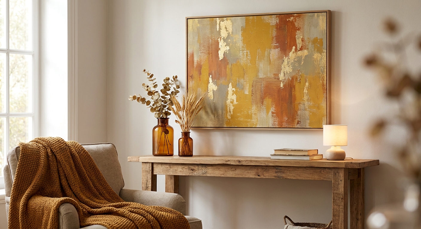
Mustard and gold wall art warms up a room the way afternoon sun does — instantly, without changing a single piece of furniture. This guide breaks down what makes mustard yellow wall art work in 2026 interiors, which prints earn a spot on your wall, and which warm-toned pieces to skip.
- Autumnat Rosenborg leads for true mustard-and-rust autumn palettes at $179.99 — buy it.
- Mustard yellow wall art reads warmest paired with rust, olive or cream, not cool grays.
- Skip pastel-mustard prints in north-facing rooms — they wash out without direct light.
- A 36x48 canvas is the safe bet above a standard sofa; smaller sizes disappear on a large wall.
Why this matters
Mustard yellow wall art has moved past the "trend piece" label. It's become a staple warm neutral alongside rust and olive in 2026 living rooms, the same way navy was the safe accent color a decade ago. The catch: mustard is a hard color to get right in print form. Too cool an undertone and it reads dated; too saturated and it fights with your furniture instead of complementing it.
The difference between a mustard print that feels intentional and one that feels like a leftover 1970s throw pillow comes down to undertone, contrast and scale — not just picking "anything yellow-ish." Gioia Wall Art's curated collection carries dozens of warm-toned canvas and framed options, but not every gold-toned piece belongs in every room.
Who this is for
This guide is for anyone decorating a living room, dining room or entryway who wants a warm accent color without committing to a full mustard accent wall. It's built for the shopper choosing between a gold-toned abstract and a rust-and-cream landscape, not for anyone hunting bold, saturated primary-color art. If your room already leans warm — terracotta tile, wood tones, brass fixtures — mustard and gold wall art is the easiest layer to add in 2026.
What to look for in mustard and gold wall art
Undertone: warm gold vs. flat mustard
True mustard has a brown-yellow base; gold leans slightly metallic and cooler. Hold the print description up against your existing wood tones — a warm gold undertone pairs with honey oak, while a flatter mustard suits darker walnut or black furniture. Getting this wrong is the single most common reason a mustard print looks "off" once it's hung.
Contrast against your wall color
Mustard and gold read differently on white walls than on greige or sage. On a neutral white wall, expect the mustard to pop forward; on a warm greige, it blends and softens. If your walls are already warm-toned, look for pieces with a stronger charcoal or black anchor color mixed in, or the whole composition can feel flat.
Size relative to your furniture
A mustard print under 24 inches wide over a 7-foot sofa reads like an afterthought. The general rule: your wall art should span roughly two-thirds the width of the furniture beneath it. Check the canvas size guide before you order if you're unsure between a 24x36 and a 36x48.
Companion palette in the room
Mustard rarely works alone. It needs at least one deeper anchor tone — rust, olive, chocolate brown or black — plus one lighter neutral like cream or oatmeal to keep the room from feeling like a single-note palette. Mapping this out before you buy saves a return; the color palette matching guide walks through pairing rules in more depth.
Finish: canvas vs. framed print
Canvas softens mustard tones slightly and reads more casual; a framed print with a black or brass frame sharpens the color and suits a more formal dining room or entryway. Neither is wrong — it depends on whether the room leans relaxed or polished.


Top picks for mustard and gold wall art in 2026
Autumnat Rosenborg — the classic pick. This piece leans into true mustard and rust tones with a landscape composition, priced at $179.99. It's the print to reach for if you want the most literal, unmistakable mustard-and-gold palette without any guesswork on undertone. Buy — it anchors an autumn-toned living room or dining space on its own.
SunriseIn Copenhagen — the warm glow pick. A softer gold-to-amber gradient at $179.99, this one works better in rooms that already have a lot of visual texture (wood beams, exposed brick) and need a calmer warm tone rather than a bold mustard block. Buy if your room leans understated; Consider if you want something punchier.
Sunrisein Amsterdam — the moody accent pick. Deeper gold tones with more shadow in the composition make this the choice for a room with dimmer, warmer lighting — think a den or a reading nook rather than a bright, sunlit living room. At $179.99, it pairs well with black-framed furniture. Consider — best suited to rooms without strong overhead light where a brighter mustard print would look washed out.
Mustard and gold wall art only works when it has one darker anchor color in the room to hold onto — without it, the palette floats.
What to avoid
- Pastel or lemon-yellow prints marketed as "mustard." True mustard has a brown base; anything closer to butter or lemon will clash with warm wood tones instead of complementing them.
- Cool-toned gray-and-mustard combos. They photograph well but feel visually cold in person once the print is on a warm-lit wall.
- Undersized prints on large walls. A single 18x24 mustard print on an 8-foot wall reads as an afterthought — go bigger, or pair it in a set. If your style already leans farmhouse or country, the farmhouse wall art guide covers scaling warm-toned prints for larger rooms in more depth.
Verdict comparison
| Undertone | Best Room | Size Available | Verdict | |
|---|---|---|---|---|
| Autumnat Rosenborg | True mustard/rust | Living room, dining room | Multiple, up to large format | Buy |
| SunriseIn Copenhagen | Warm gold gradient | Bedroom, hallway | Multiple sizes | Buy |
| Sunrisein Amsterdam | Deep amber/gold | Den, reading nook | Multiple sizes | Consider |
FAQ
What's the best wall art color to pair with mustard yellow?
Rust, olive and deep charcoal pair best with mustard yellow wall art in 2026 interiors. Cream or oatmeal neutrals work as a lighter counterbalance so the palette doesn't read as one flat tone.
Is mustard yellow wall art too trendy to last?
Mustard has held steady as a warm neutral accent since the early 2020s and isn't a short-lived micro-trend. Pairing it with classic neutrals like cream and charcoal keeps the room from feeling dated if the trend shifts.
What size mustard wall art works above a sofa?
A 36x48 inch canvas covers roughly two-thirds the width of a standard 7-foot sofa, which is the general sizing rule for above-sofa art. Smaller pieces under 24 inches wide tend to look undersized on that wall.
How do I keep mustard wall art from looking dated?
Choose a true mustard-brown undertone rather than a flat lemon yellow, and pair it with at least one darker anchor color like rust or black. The 1970s association usually comes from pairing mustard with cool grays instead of warm neutrals.
Does mustard wall art work in a small room?
Yes, but stick to one mustard-toned piece rather than multiple, and keep the surrounding wall color neutral so the room doesn't feel visually crowded. A single statement print reads better in a small space than a gallery cluster of warm tones.
What wall color pairs best with mustard and gold prints?
Warm white, greige and soft sage all work well behind mustard and gold wall art. Stark cool white can make the mustard tone look harsher than intended.
Can I mix mustard wall art with black and white photography?
It works in small doses, usually one black-and-white piece as an accent rather than a full gallery mix. Too much contrast between the two palettes in one wall grouping tends to compete rather than complement.
How much does mustard-toned canvas wall art typically cost?
Curated mustard and gold canvas prints typically run around $179.99 to $209.99 depending on size and finish in 2026. Framed versions usually cost more than unframed canvas due to the added materials.
One last thing
Mustard wall art shifts noticeably under bulb temperature — a 2700K warm bulb deepens the gold tone, while a 4000K "daylight" bulb can make the same print look flatter and more olive than intended. Check your room's lighting before you commit to a print that reads warm in a photo but cooler under your actual fixtures.


