
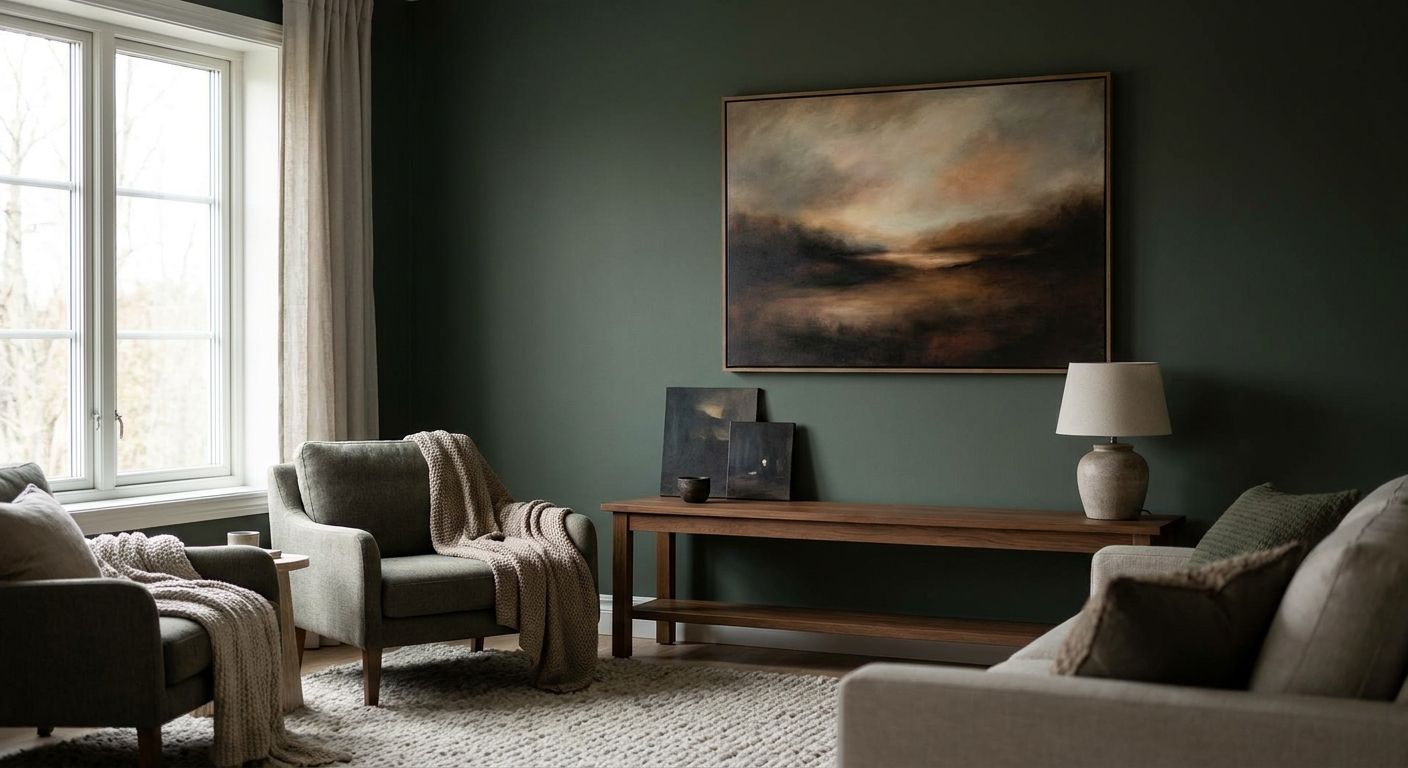
North-facing rooms get flat, cool, indirect light all day, and that light changes how every color, finish and contrast level on your wall reads. Pick wall art the way you'd pick paint for a dim room, and the space stops feeling gray and starts feeling intentional.
- Warm, high-contrast pieces read best as wall art for low light rooms — cool pastels wash out under north light.
- Bright Citrus Still Life and Vibrant Sunset Landscape from Gioia Wall Art both carry warm undertones built for dim rooms. Buy.
- Matte canvas beats glossy framed prints in north-facing spaces because glare from artificial light kills detail. Skip high-gloss glass.
- Oversized single statement pieces outperform small groupings when natural light is limited in 2026 interiors.
Why this matters
North-facing rooms never get direct sun, so the light stays cool and consistent but low in intensity, which flattens color and softens contrast on anything hung on the wall. A print that looks rich in a south-facing showroom photo can look muddy and forgettable once it's on your dim living room wall. Getting this right isn't about buying "brighter" art, it's about buying art with built-in warmth and contrast so the room doesn't need to do the work the light can't do. Get the color temperature and contrast level wrong, and even a 179.99 canvas print reads as an afterthought instead of a focal point.
What you'll need
- A tape measure and painter's tape to mock up placement before you commit
- A photo of the room taken at midday and again at dusk under your actual bulbs
- A swatch or paint chip from the wall color behind the intended hanging spot
- One statement piece with warm undertones (terracotta, mustard, coral, warm citrus) rather than cool blues or pale gray-toned prints
- A lamp or picture light rated 2700K-3000K if the room relies on artificial light after 4pm
- 30-45 minutes for measuring, mocking up, and stepping back to judge from across the room
The steps
1. Audit the room's actual light, not its listed orientation
A room labeled "north-facing" can still get decent bounce light if it has a light-colored floor or a mirror opposite the window. Stand in the room at 10am and 3pm and note how much the wall you're targeting actually brightens versus staying flat gray. This tells you whether you need a warm-toned piece to compensate or just a higher-contrast one to hold its shape under dim conditions. Skipping this step is the most common mistake — people assume all north light behaves the same, and it doesn't once you factor in nearby buildings, trees, or reflective surfaces.
Common mistake: judging the room's brightness from a phone photo, which auto-adjusts exposure and makes a dim room look brighter than it is.
2. Choose warm undertones over cool palettes
Cool blues, icy grays and pale lavender prints amplify the coolness already in north light and can make a room feel colder than it already is. Warm terracotta, mustard, coral, and warm green tones counteract that cast and bring visual temperature back into balance. A piece like Bright Citrus Still Life works specifically because its warm yellows and oranges push against the cool cast instead of blending into it. If you love a cooler palette, pair it with warm framing or a warm-toned mat rather than skipping the correction entirely.
3. Prioritize contrast over subtlety
Low-contrast, tonal artwork (think soft gray-on-gray abstracts) disappears in dim light because there's nothing for the eye to grab onto. Pieces with a clear dark-to-light range read as sharp and intentional even when the room's ambient light sits at a fraction of a sun-facing room's brightness. This is why best-abstract-canvas-prints-for-modern-living-rooms skews toward bold color-blocked pieces rather than muted tonal studies — that contrast is doing real work in low-light spaces.
4. Match the print finish to your lighting plan
Glossy or heavily varnished framed prints throw glare under lamp light and picture lights, which is exactly the artificial light most north-facing rooms lean on after dark. Matte canvas absorbs light rather than bouncing it, so detail stays visible whether you're viewing it at noon or under a 60-watt lamp at 8pm. If you're set on a framed print, ask for non-glare glass rather than skipping the frame altogether.
5. Go one size larger than you think you need
Small pieces read as clutter in dim rooms because there's less light to define their edges against the wall. A single oversized piece, or a tight two-piece pairing, holds visual weight without needing extra brightness to register. If you're unsure what size actually fits your wall, how-to-choose-the-right-canvas-size-for-your-wall walks through the measuring math so you're not guessing.
6. Test the color palette against your actual wall paint
Hold your paint swatch next to the print's dominant colors under the room's real lighting conditions, not a store's fluorescent overhead lights. Cool white or gray-blue wall paint paired with a cool-toned print doubles down on the flatness this whole guide is trying to fix. If your walls already lean cool, lean warmer with the art; if your walls are warm (cream, tan, soft beige), you have more flexibility. how-to-match-wall-art-to-your-room-s-color-palette covers the pairing logic in more depth if you're working with a specific paint color already on the wall.
7. Add a picture light or warm lamp if the room goes dark by late afternoon
No canvas print, no matter how warm or high-contrast, competes with total darkness. A picture light rated 2700K-3000K restores the warmth and contrast your daytime audit found missing, and it lets a bold piece like Vibrant Sunset Landscape stay a focal point after sunset instead of fading into the wall.
8. Step back and re-check from the room's main sightline
Stand where you actually sit or walk through the room, not two feet from the wall, and look at the piece under both daytime and evening light. This final check catches placement or scale problems before the nail holes go in. Expect the piece to look slightly more subdued from ten feet away than it did up close in a listing photo — that's normal and part of why contrast and warmth matter more than fine detail in low-light rooms.


Troubleshooting
The piece looked vibrant online but flat on the wall. Check the room's light temperature — if your bulbs run above 4000K (cool white), swap to 2700K-3000K bulbs before blaming the art itself.
The room still feels cold even with a warm-toned piece hung. One print rarely fixes an entire room's temperature; add a warm-toned rug, throw, or lamp to reinforce the correction.
Glare shows up on the print at night. You likely have glossy canvas varnish or glass-framed art catching light from a nearby lamp; reposition the light source at an angle instead of straight-on, or switch to matte canvas.
The artwork feels too small for the wall now that it's hung. This is the single most common sizing mistake in dim rooms — size up, or add a second piece to create visual weight rather than leaving negative space.
Colors look different from the product photos. Product photography is typically shot under bright, even studio light; expect warm tones to read slightly more muted and cool tones to read noticeably flatter once hung in a north-facing room.
Tools and resources
- how-to-match-wall-art-to-your-room-s-color-palette for pairing logic against your specific wall paint
- how-to-choose-the-right-canvas-size-for-your-wall for measuring math before you buy
- best-abstract-canvas-prints-for-modern-living-rooms for bold, high-contrast options built for dim spaces
- A tape measure, painter's tape, and a 2700K-3000K picture light or lamp
What to do next
Once the piece is hung and the lighting is dialed in, the next question is usually placement — flower-market-wall-art-for-kitchen-decor covers how warm floral pieces work in another commonly dim room, the kitchen, if your north-facing space happens to be there.
FAQ
What's the best wall art for a low light room?
Warm-toned, high-contrast pieces work best as wall art for a low light room in 2026 because they counteract the cool, flat cast of indirect light. Cool pastels and low-contrast tonal prints tend to disappear against dim walls.
Is canvas or framed art better for a north-facing room?
Matte canvas generally outperforms glossy framed prints in north-facing rooms because glare from lamps and picture lights washes out detail on glass. If you want a frame, ask for non-glare glass.
Does wall art size matter more in dim rooms?
Yes — small pieces lose definition faster than large ones when ambient light is low, so sizing up one level from what you'd choose in a bright room usually reads better.
Should I avoid blue and gray wall art in a north-facing room?
Not entirely, but cool blues and grays amplify the coolness already present in north light, so balance them with warm framing, a warm mat, or warm accessories nearby.
What light temperature works best for lighting art in a dim room?
Bulbs rated 2700K-3000K restore warmth that north light lacks and help contrast-heavy pieces hold their color after dark.
How much does wall art for a low light room typically cost?
Canvas prints at Gioia Wall Art run around 179.99, with pricing varying by size and finish across the full 6,000-piece catalog.
Can original paintings work in low light rooms?
Yes, as long as the palette leans warm and the brushwork or composition creates enough contrast to register without direct sun hitting it.
Do gallery walls work in north-facing rooms?
Gallery walls can work, but a single oversized statement piece is often easier to get right in dim rooms since it avoids the visual clutter multiple small frames can create without strong light to separate them.
One last thing
The detail most people miss: a warm-toned print doesn't just look better in a north-facing room, it actually changes how warm the whole wall reads at night, because artificial light bounces off warm pigment differently than it does off cool pigment. That's the whole trick — you're not fighting the room's light, you're borrowing warmth the room doesn't naturally have.


