
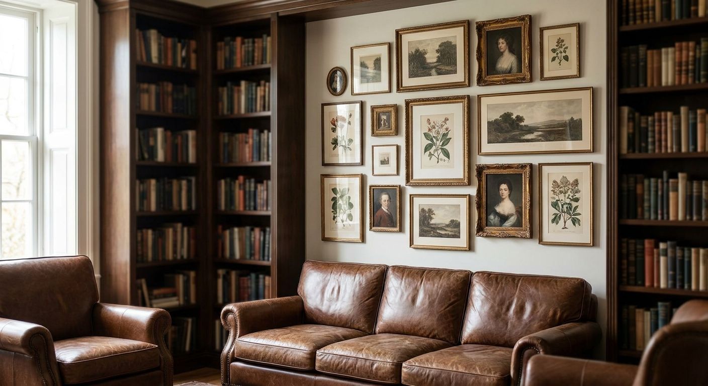
Bookshelves fill the walls in a home library, but the gaps between shelving units, above eye level, and along stair landings need art that reads as curated rather than accidental — and framed pieces do that job better than canvas in a room built around glass, spines, and reading lamps.
- Framed art for a home library wins over unframed canvas because glass and matting hold up near reading lamps and window glare.
- Vertical fine art prints sized 16x20 to 24x36 fit the narrow gaps between built-in shelving better than oversized canvas.
- Black-and-white photography and botanical still lifes pair with wood shelving without competing with book spine colors.
- Skip mass-produced quote posters in a library — they read as generic next to a curated book collection.
- Walnut and black frames outperform white frames in libraries with warm wood shelving in 2026.
Why this matters
A library is one of the only rooms in the house where the walls are already doing visual work before art enters the picture. Book spines carry color, texture, and pattern on their own, so wall art for reading nooks needs to complement that noise rather than fight it.
Framed art specifically solves a problem canvas doesn't: glare control near reading lamps and window light, and a finished edge that reads intentional next to leather-bound spines and glass-front cabinets. A gallery-wrapped canvas floats on the wall; a framed print sits inside a boundary, which is exactly the visual language a library already speaks with its shelving.
How this list was built
The picks below are ranked on four things that matter specifically in a book-heavy room: how the piece handles limited wall real estate between shelving units, whether the color palette works against wood tones and spine colors, frame durability near reading lamps, and price relative to piece size. Subject matter that reads as "library-appropriate" — portraiture, botanicals, black-and-white photography, maps, and abstract line work — scored higher than trend-driven pieces that date quickly.
The ranked picks
1. The reading corner classic — vertical black-and-white photography
A single vertical black-and-white photograph in a slim walnut frame, sized 16x20 to 20x30, is the safest bet for the wall beside a reading chair. The frame width matters more than people expect: anything over 2 inches starts to compete with book spines instead of framing around them. Framed art prints for home offices follow the same sizing logic since both rooms deal with narrow wall segments between furniture and shelving. Buy — this is the piece that works in almost every library layout built in 2026.
2. The nook specialist — small-format sets for shelf gaps
Built-in shelving rarely leaves a clean rectangle of wall space; it leaves odd slivers 12 to 18 inches wide. A set of two or three small framed prints, each under 12x16, slots into those gaps without forcing a shelf redesign. This is the category built for exactly that constraint. Buy for libraries with floor-to-ceiling built-ins and irregular gaps.
3. The statement piece — large-format art above a ladder or tall shelving
If the library has a rolling ladder or shelving that runs past 8 feet, one oversized framed print (30x40 or larger) above the top shelf line anchors the vertical space instead of leaving it blank. This only works when the room has at least 10 feet of unobstructed wall height — anything shorter and the piece looks stuffed in. Consider — strong when the ceiling height supports it, skip in standard 8-foot rooms.
4. The vintage bibliophile pick — maps, botanicals, and travel-era prints
Vintage-style botanical prints and travel-era imagery in gold or brass frames lean into the collected, well-read look a library is going for in the first place. These pair naturally with leather-bound spines and brass reading lamps because the frame finish echoes the hardware already in the room. Buy for traditional or Old World library styling; Skip if the room leans mid-century or minimalist.
5. The fine art investment — museum-quality individual prints
One larger, individually framed fine art print with a wide mat (3 to 4 inches) does more for a library's credibility than three smaller pieces combined, because the negative space around the print mimics the white space of a well-typeset page. This works best centered on the one uninterrupted wall a library usually has — often behind a desk or reading chair rather than between shelves. Buy if that wall exists; otherwise this pick doesn't have anywhere to go.
6. The skip — mass-produced motivational quote posters
Generic "Read More Books" or typography-only posters read as filler next to an actual book collection, and the paper stock most of these ship on doesn't hold up under sustained lamp exposure. A library full of real books doesn't need a poster telling visitors to read. Skip, full stop, no matter how the room is styled.


Comparison table
| Pick | Best for | Frame finish | Size range | Verdict |
|---|---|---|---|---|
| Reading corner classic | Slim wall next to a chair | Walnut, black | 16x20 to 20x30 | Buy |
| Nook specialist set | Irregular shelf gaps | Mixed, thin profile | Under 12x16 each | Buy |
| Statement piece | Tall shelving, 10ft+ ceilings | Black, wide molding | 30x40 and up | Consider |
| Vintage bibliophile pick | Traditional/Old World styling | Gold, brass | 18x24 to 24x36 | Buy for the right style |
| Fine art investment | One clear feature wall | White mat, black frame | 24x36 and larger | Buy if the wall exists |
| Quote poster | Nowhere in a real library | N/A | N/A | Skip |
What to avoid
- White frames on a heavily wood-toned wall. They look clean in isolation but wash out against oak or walnut built-ins — go black, walnut, or brass instead.
- Glossy glazing near a window. Reading nooks usually sit next to natural light, and standard glass throws glare that non-glare or matte glazing avoids.
- Art sized to fill a wall rather than fit a gap. In a library, the shelving dictates the available rectangle — measure the actual gap before choosing a size, don't pick a size and hope it fits.
Where to buy and how to source it
Buy pieces in a consistent frame family — same wood tone or same black finish — even when the subjects differ, so a library built over several purchases still reads as one collection instead of a mismatch. If the room mixes in personal photography alongside curated fine art, the same framing math applies across both: canvas photo prints for wedding photo displays use the same consistent-mat-width principle to make a run of personal images read as intentional rather than thrown together. Source larger statement pieces first, since they set the frame finish for everything smaller that follows.
FAQ
What size framed art works best for a home library?
Most library gaps between shelving run 12 to 24 inches wide, so framed prints between 16x20 and 24x36 fit without forcing a shelf redesign in 2026-era built-ins. Larger 30x40 pieces only work above shelving that runs past 8 feet.
Should wall art match the color of my book spines?
No — art should complement the spine colors, not match them exactly, since matching often reads as too coordinated. Black-and-white photography or muted botanical prints sit neutrally against almost any spine palette.
Is it okay to hang framed art in front of open bookshelves?
Framed art works better on the wall segments between or above shelving units rather than directly over open shelves, since covering books defeats the purpose of a library. Reserve full walls or shelf-top space for art instead.
How high should art hang above a low bookshelf?
Leave 6 to 10 inches between the top of the shelf and the bottom of the frame so the piece reads as separate from the furniture. Anything tighter than 6 inches starts to look like it's resting on the shelf.
What subject matter works best in a home library?
Portraiture, botanicals, black-and-white photography, maps, and abstract line work read as library-appropriate because they don't compete visually with book spines. Bright, high-saturation prints or text-heavy posters tend to clash with the room's existing color noise.
Do unframed canvas prints work in a library, or should everything be framed?
Framed pieces suit libraries better overall because the finished edge matches the visual language of glass-front cabinets and bound books, but one or two canvas pieces on an open wall away from shelving can work as contrast. Mixing both in the same tight cluster usually looks unplanned.
How much does framed art for a home library cost in 2026?
Individually framed fine art prints for a library typically run in the range most home decor buyers already budget for wall art in 2026, with larger statement pieces costing more than small-format sets. Pricing varies by size, frame material, and print type, so check current listings for exact figures.
Should every piece in a home library match the same frame style?
Pieces should share a frame family — the same wood tone or the same black finish — even if the subjects vary, so purchases made months apart still read as one collection. Mixing gold, white, and black frames in the same sightline is the fastest way to make a curated room look accidental.
One last thing
The piece that gets skipped most often in a library isn't a bad print — it's the right print hung at the wrong height. A frame centered at standard 57-inch eye-level looks off next to shelving that runs to 8 feet, because the room's real sightline sits higher than a typical living room. Measure from the top of the nearest shelf, not the floor, before deciding where the center of the frame goes.


