
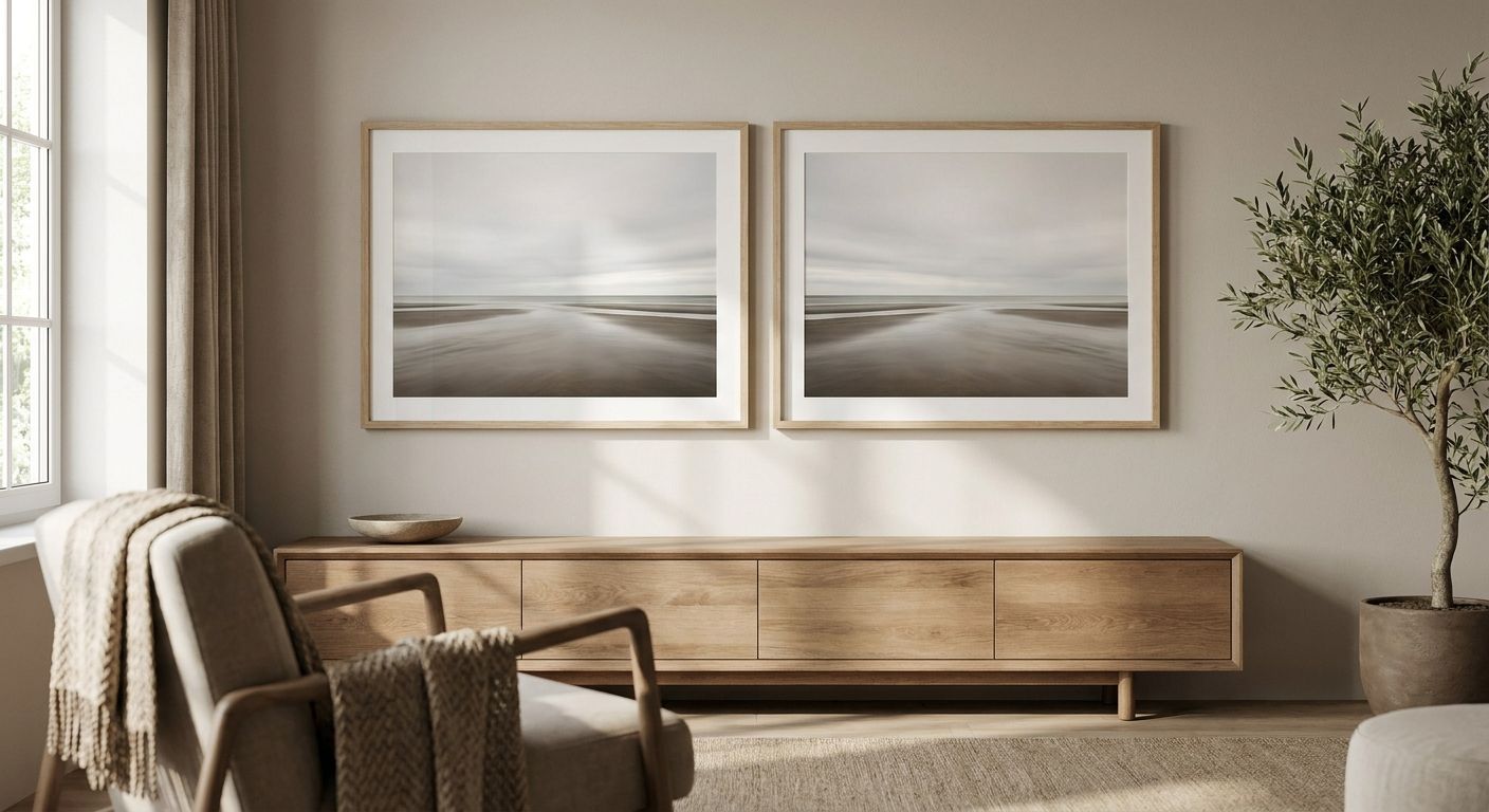
Diptych wall art turns two canvases into one symmetrical statement, and getting the pairing right has more to do with matching visual weight than matching frames. This guide ranks six diptych wall art approaches that hold up over a real wall, in a foyer, or above a headboard, and tells you which one fits your layout in 2026.
Best overall: a botanical diptych duo carries symmetry into living rooms and entryways without fighting the furniture around it. Best for above-the-bed layouts: a matched abstract pair holds equal visual weight on either side of a headboard. Best budget-friendly option: a DIY diptych built from two single canvases in a shared palette, no matched "set" required.
- Best overall diptych wall art: a botanical duo works in living rooms and entryways without crowding furniture.
- Best for above-the-bed symmetry: a matched abstract pair balances equal weight on both sides of a headboard.
- Best budget option: a DIY diptych built from two single canvases sharing one color palette.
- Diptych wall art fails when panels don't share a sightline — keep 2 to 3 inches between frames, no more.
- Diptych wall art works when both panels share color, subject, or framing, never just matching size.
Why this matters
A single oversized canvas reads as one decision. Two canvases hung as a pair read as a designed moment, which is exactly why diptych wall art shows up so often in the canvas art sets for gallery walls style of layout Gioia Wall Art gets asked about most.
The catch: two panels that don't share a common thread just look like two separate purchases hung too close together. Symmetry lives in the relationship between the panels, not in the panels themselves.
Most diptych mistakes in 2026 come down to three things: mismatched scale, mismatched color temperature, and gaps that are too wide or too narrow for the eye to read the pair as one piece. Fix those three and the rest of the styling takes care of itself.
What makes the best diptych wall art
- Shared visual anchor — a repeated color, subject, or line that ties both panels together
- Matched scale — panels close in height (within a few inches) so the eye reads them as level
- Consistent framing — both canvases finished the same way; one framed and one unframed breaks the pair
- Correct spacing — 2 to 3 inches between panels for a tight, cohesive look; wider gaps read as two separate pieces
- Room-appropriate subject — botanicals and abstracts read calmer for bedrooms; bold color or graphic work reads better in entryways and living rooms
Diptych wall art at a glance
| Diptych style | Best for | Standout feature | Key limitation |
|---|---|---|---|
| Botanical diptych duo | Living rooms and entryways | Reads as one composition even in busy sightlines | Can feel too soft for maximalist or bold interiors |
| Matched abstract pair | Above-the-bed symmetry | Equal visual weight on both sides of a headboard | Needs a matched frame or canvas depth to look intentional |
| Vintage travel diptych | Eclectic, well-traveled homes | Built-in narrative between the two panels | Harder to keep the palette consistent across two different scenes |
| Black-and-white photography diptych | Small apartments | Low visual noise, works in tight sightlines | Loses impact without strong contrast between the two shots |
| Calming color-block pair | Meditation rooms, quiet bedrooms | Simple palette keeps the space visually quiet | Can read flat without a texture or paint-stroke detail |
| DIY custom diptych | Personalized gifts, budget layouts | No matched "set" needed, built from pieces you already like | Requires more of your own eye for color matching |
1. Botanical diptych duo: best diptych wall art for living rooms and entryways
A botanical diptych pairs two floral or leaf-forward canvases with a shared color story, hung close enough to read as one piece. It works because botanicals carry enough detail to hold a wall on their own, but soft enough color palettes to sit behind a sofa or console table without overwhelming the room.
Botanical diptych pros:
- Reads as one composition from across the room
- Palette flexibility across Cottagecore, Coastal Luxe, and traditional interiors
- Softens hard architectural lines in entryways
Botanical diptych cons:
- Can feel too soft for bold, maximalist interiors
- Two florals with mismatched color temperature (warm versus cool) break the symmetry fast
Best for: living rooms, entryways, dining nooks. Verdict: Buy — this is the safest diptych pairing for a first attempt at symmetrical wall art in 2026.
2. Matched abstract pair: best diptych wall art for above-the-bed symmetry
An abstract diptych puts two canvases with the same color-block or gestural style on either side of a headboard, or centered as one unit. Because abstract work reads by color and shape rather than subject, mismatched scale shows up immediately, so this pairing depends more on matched size than any other style on this list.
Abstract diptych pros:
- Strong visual anchor for primary bedrooms and guest rooms
- Works in both bold and neutral palettes
- Pairs cleanly with the layout advice in wall art for primary bedroom retreats
Abstract diptych cons:
- Needs matched canvas depth or frame to avoid looking like two separate purchases
- Loses impact in low-light, north-facing rooms without warmer undertones
Best for: above-the-bed symmetry. Verdict: Buy if the two panels share brushstroke style and color temperature; Skip if you're mixing two unrelated abstract prints.
3. Vintage travel diptych: best diptych wall art for well-traveled, eclectic homes
A vintage travel diptych pairs two poster-style prints, often two cities or two eras, hung side by side to tell a small story. This is the diptych style with the most built-in narrative: the pairing does half the design work for you because the subject matter already relates.
Vintage travel diptych pros:
- Instant conversation piece for entryways and home offices
- Palette-matched sets are easier to find than with photography diptychs
- Fits Boho, Eclectic, and Grand Tour interior styles
Vintage travel diptych cons:
- Harder to keep color palette consistent across two different scenes or eras
- Not ideal for minimalist or Japandi interiors
Best for: eclectic, well-traveled homes. Verdict: Buy for character-driven spaces; browse the full range at vintage travel posters for well-traveled homes before committing to a pair.
4. Black-and-white photography diptych: best diptych wall art for small apartments
A black-and-white photography diptych uses two monochrome shots, often the same subject from two angles or two related scenes, to create symmetry without adding visual clutter. It's the lowest-noise option on this list, which matters most in apartments where every wall does double duty.
Photography diptych pros:
- Low visual noise, reads calm in tight sightlines
- Matches almost any furniture color since it's neutral
- Scales down well for smaller wall segments
Photography diptych cons:
- Loses impact without strong contrast between the two shots
- Can feel cold in rooms that already lean neutral or minimal
Best for: small apartments, studio layouts. Verdict: Buy for compact rooms; pair with the sizing notes in canvas prints for small apartments before ordering.
5. Calming color-block pair: best diptych wall art for meditation and quiet bedrooms
A color-block diptych relies on two panels in adjacent or complementary tones, often with minimal subject matter, to keep a room visually quiet. This is the pairing that works hardest in rooms meant for rest rather than conversation.
Color-block diptych pros:
- Simplest pairing rule on this list: match the palette, not the subject
- Reads calm in bedrooms, yoga corners, and reading nooks
- Easiest style to size down for narrow walls
Color-block diptych cons:
- Can read flat without a texture or paint-stroke detail somewhere in the piece
- Not a statement pairing for rooms meant to impress guests
Best for: meditation spaces, quiet bedrooms. Verdict: Hold for main living areas; Buy for any room where the goal is calm over conversation.
6. DIY custom diptych: best diptych wall art for personalized gifts and budget layouts
A DIY diptych skips the matched "set" entirely. Two single canvases, chosen because they already share color or subject, are hung as a pair. This is the most flexible diptych wall art option because it doesn't depend on finding one product listed as a diptych at all.
DIY diptych pros:
- Works with pieces you already own or plan to buy separately
- Most flexible for personalized gifts, anniversaries, or family walls
- No dependency on one single product being labeled a "set"
DIY diptych cons:
- Requires more of your own eye for color and scale matching
- Higher risk of mismatch than a pre-designed pair


Best for: personalized walls, gifting, and anyone building a pair on a tighter budget. Verdict: Buy if you're confident pairing color and scale yourself; Hold if you'd rather start from an already-matched pairing.
“If the two panels don't line up within an inch of each other, the symmetry breaks before anyone notices why.”
How this ranking was built
Each diptych style above is ranked against the five criteria in the "what makes the best diptych wall art" section: shared visual anchor, matched scale, consistent framing, correct spacing, and room-appropriate subject. No two styles compete for the same room type, which is why this reads as a decision tree rather than a leaderboard — pick your room first, then your pairing.
Which diptych wall art should you choose?
For most homes in 2026, the botanical diptych duo is the safest starting point — it works in the widest range of interior styles and forgives small mismatches better than abstract or photography pairs. If the wall in question sits above a bed, go with the matched abstract pair instead, since equal visual weight matters more there than anywhere else in the house. Building on a tighter budget or working from pieces you already love, the DIY custom diptych gets you symmetry without waiting on a pre-matched set.
FAQ
What is diptych wall art?
Diptych wall art is two canvases or prints designed or chosen to hang together as one symmetrical composition, usually sharing color, subject, or framing. The pair reads as a single design decision rather than two separate purchases.
Is diptych wall art better than one large canvas for symmetry?
Neither is universally better; a diptych creates a wider visual footprint for the same wall space, while one large canvas is simpler to hang level. Diptychs suit walls that need width, such as above a bed or sofa, more than height.
How much space should you leave between two diptych panels?
Leave 2 to 3 inches between the two panels for a cohesive look. Wider gaps make the pair read as two unrelated pieces instead of one symmetrical statement.
Can you hang a diptych above a bed?
Yes, a matched abstract or botanical diptych works well above a bed as long as both panels carry equal visual weight. Center the pair on the headboard rather than the wall for the cleanest symmetry.
What size diptych wall art works best for a small apartment?
Smaller, low-contrast pairings such as black-and-white photography diptychs scale down best for apartments, since they add symmetry without visual clutter. Measure the wall segment first, then size each panel to leave breathing room on both sides.
Do diptych panels have to match in size?
They don't have to be identical, but they should be close in height so the eye reads them as level. A significant size mismatch is the fastest way to break the symmetry a diptych is meant to create.
How much does diptych wall art cost in 2026?
Pricing depends on canvas size, print type, and whether the pair is pre-matched or built from two separate pieces. Check current pricing on the product pages directly since options and sizes vary.
Can you make your own diptych from two different photos?
Yes, a DIY diptych built from two separate photos works as long as the color palette and subject matter relate to each other. This is the most flexible and often most personal diptych option for gifts or family walls.
One last thing
The diptych pairings that hold up longest in 2026 aren't the ones with matching frames — they're the ones with matching color temperature. A warm botanical next to a cool one will fight for attention no matter how identical the frames look; fix the undertone first, and the rest of the symmetry follows on its own.


