
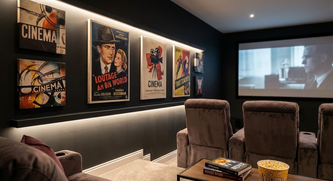
Home theater wall art has one job a living-room canvas doesn't: disappear into the dark instead of competing with the screen for attention. Get the finish, color, and scale wrong and you've got glare spots and a wall that fights every movie night. This guide ranks the print styles that actually work on a theater accent wall in 2026, and names the ones to skip.
- Home theater wall art wins on matte finish — glossy and metallic canvases bounce projector light back at the screen.
- Matte black-and-white photography is the safest home theater wall art pick for rooms with a 100-inch or larger screen.
- Deep emerald and jewel-tone abstract canvas mimics velvet cinema drapery without reflecting glare. Buy.
- A single extra-large panel beats a multi-panel gallery set next to a wide projector screen. Buy.
- Gold leaf and metallic canvas creates hotspots under projector light in 2026 media rooms. Skip.
Why this matters
A theater accent wall behaves nothing like the rest of your house. The lights go down, a projector or a large-format TV throws light across the room, and whatever's hanging next to it either helps the mood or ruins it. Glossy paper and metallic finishes reflect ambient light straight back at the screen, which is exactly what you don't want during a movie.
Gioia Wall Art gets asked about home theater wall art constantly, and the pattern is consistent: matte canvas finishes hold up, glossy and metallic ones don't. Before you pick a print, get the canvas size guide sorted — a piece that's undersized for the wall looks like an afterthought next to a big screen, and oversized art in a small media room reads as clutter, not a statement.
The same logic that governs any accent wall styling project applies here, just with lower light tolerance. Dark tones, matte texture, and scale relative to the screen are the three variables that separate a theater wall that works from one that doesn't.
How this list was ranked
Each pick below is judged on four criteria: finish (matte versus glossy or metallic), how the color reads under low ambient light, scale relative to a typical projector or large-screen setup, and whether the style still looks intentional with the lights on. Home theaters get used in daylight too — for gaming, sports, or a bright afternoon rewatch — so a print that only works in total darkness doesn't make the cut.
This isn't a lab test. It's aggregated interior styling guidance built from the same principles that govern any low-light accent wall: matte over glossy, deep tones over pastels, one bold statement over a busy gallery grid.
The ranked picks
1. Matte black-and-white photography — the classic-cinema pick
Matte canvas scatters light instead of mirroring it back at the screen, which is why black-and-white photography reads so well in a dim room. A single 40x60 inch piece centered above a media console or credenza covers the 60-75% wall-width ratio design pros default to, and it reads as intentional whether the projector is on or off.
Black and white photography wall art works in nearly any theater layout, from a dedicated media room to a converted basement. Verdict: Buy.
2. Emerald and jewel-tone abstract canvas — the velvet-curtain look
Deep emerald and jewel-tone abstracts do what old cinema drapery used to do: absorb light instead of bouncing it. The dark background keeps ambient glow from washing out the screen, and the saturated color still reads rich with the lights on for pre-movie hangouts.
Emerald and dark green wall art pairs especially well with black leather or dark wood theater seating. Verdict: Buy.
3. Navy and indigo abstract canvas — the cooler-toned runner-up
Navy and indigo work on the same principle as emerald — dark, matte, light-absorbing — but they skew cooler and pair better with rooms that already lean blue or gray. It's a solid pick, just not the top one, because the cooler palette can feel flat under warm ambient lighting.
Verdict: Hold if your room runs warm-toned; buy if your seating and trim are already cool-toned.
4. Extra-large single-panel statement canvas — the go-big pick
A theater wall wider than 12 feet with a 100-inch-plus screen needs scale, and a busy multi-panel gallery set next to a screen bezel just adds visual noise. One oversized matte panel does the job with a single clean edge.
Gioia's extra-large canvas wall art collection is built for exactly this kind of statement wall. Verdict: Buy for wide rooms; skip it in a media nook under 150 square feet, where it will overwhelm the space.
5. Minimalist line art — the low-key pick for small rooms
Small home theaters and media nooks don't need a heavy dark canvas to feel intentional. A single-line or fine-line print in a neutral palette keeps the wall from feeling cramped while still reading as deliberate décor rather than an empty gap.
Verdict: Hold — great in tight rooms under 150 square feet, unnecessary in a full dedicated theater with a big screen.
6. Sports and pop-culture canvas — the shared-room crowd-pleaser
If the theater room doubles as a family hangout space rather than a dedicated dark room, a bolder, more personal print earns its spot. This is the category that leans into personality over pure light-control logic — think framed movie posters, sports memorabilia canvas, or a bold graphic print.
Verdict: Wait until you know who actually uses the room daily — this pick only works if everyone sharing the space likes the theme.
7. Glossy or metallic finish canvas — the one to skip
Glossy coatings and gold-leaf or metallic finishes reflect projector light directly, creating hotspots on the print itself and throwing stray light back onto the screen. It's the single most common mistake buyers make when they pick a theater wall print based on how it photographs online instead of how it behaves in a dark room.
Verdict: Skip for any wall within direct line of sight of a projector or large screen.
“If a print looks better with the lights on than the lights off, it's not a home theater pick.”
Comparison table
| Pick | Finish | Best theater size | Verdict |
|---|---|---|---|
| Black-and-white photography | Matte | Any size, above a console | Buy |
| Emerald/jewel-tone abstract | Matte | Warm-toned rooms | Buy |
| Navy/indigo abstract | Matte | Cool-toned rooms | Hold |
| Extra-large single panel | Matte | Screens 100 in.+, walls 12 ft.+ | Buy |
| Minimalist line art | Matte | Rooms under 150 sq ft | Hold |
| Sports/pop-culture canvas | Matte or satin | Shared family theaters | Wait |
| Glossy or metallic finish | Glossy | Not recommended near a screen | Skip |
Where to source it
- Check the finish before you buy, not after. Product listings should specify matte canvas or fine art paper — if it's not stated, ask before ordering for a theater wall.
- Match depth to seating distance. A thicker canvas wrap reads better from theater seating set 8 to 12 feet back than a thin, flat print does.
- Order a color proof if you're matching a specific dark palette. Screens render jewel tones differently than they look in person, and a theater wall is not the place to guess.
FAQ
What's the best wall art for a home theater accent wall?
Matte black-and-white photography and deep jewel-tone abstract canvas are the safest home theater wall art picks for 2026, because both absorb ambient light instead of reflecting it back at the screen. Glossy or metallic finishes are the ones to avoid.
Should home theater wall art be glossy or matte?
Matte, always. Glossy and metallic finishes bounce projector or screen light back into the room and create distracting hotspots on the print itself.
How big should a canvas print be for a home theater wall?
Aim for the canvas to span 60-75% of the wall width, centered around 57-60 inches high. A room with a screen 100 inches or wider generally needs one large panel rather than a multi-piece gallery set.
Is black and white photography good for home theater walls?
Yes, it's one of the strongest choices because the neutral tones and matte finish hold up whether the lights are on or off. It also pairs with almost any theater seating color.
Can I put wall art directly behind a projector screen?
No. Art directly behind or beside the screen should sit far enough away that it doesn't catch spill light; place it on an adjacent wall or above a console instead.
What colors work best for home theater accent walls?
Deep, saturated tones like emerald, navy, and indigo work best because they absorb rather than reflect ambient light. Pastels and bright whites tend to wash out and draw the eye away from the screen.
How do I hang canvas art on a home theater wall without damaging it?
Use a stud-mounted hook or a wall anchor rated for the canvas weight, and check placement against seating sightlines before drilling. A full walkthrough is in the canvas hanging guide.
Is metallic or gold leaf wall art a bad choice for a theater room?
Yes, for any wall in the projector's or screen's line of sight. The reflective finish scatters light and undercuts the exact darkness a theater room is built for.
One last thing
The print isn't usually where theater walls go wrong — the frame is. A glossy black frame around an otherwise perfect matte canvas can throw nearly as much stray light as the print itself would have in a glossy finish, so if you're framing anything near the screen, keep the frame matte or skip it and go with a gallery-wrapped canvas instead.


