
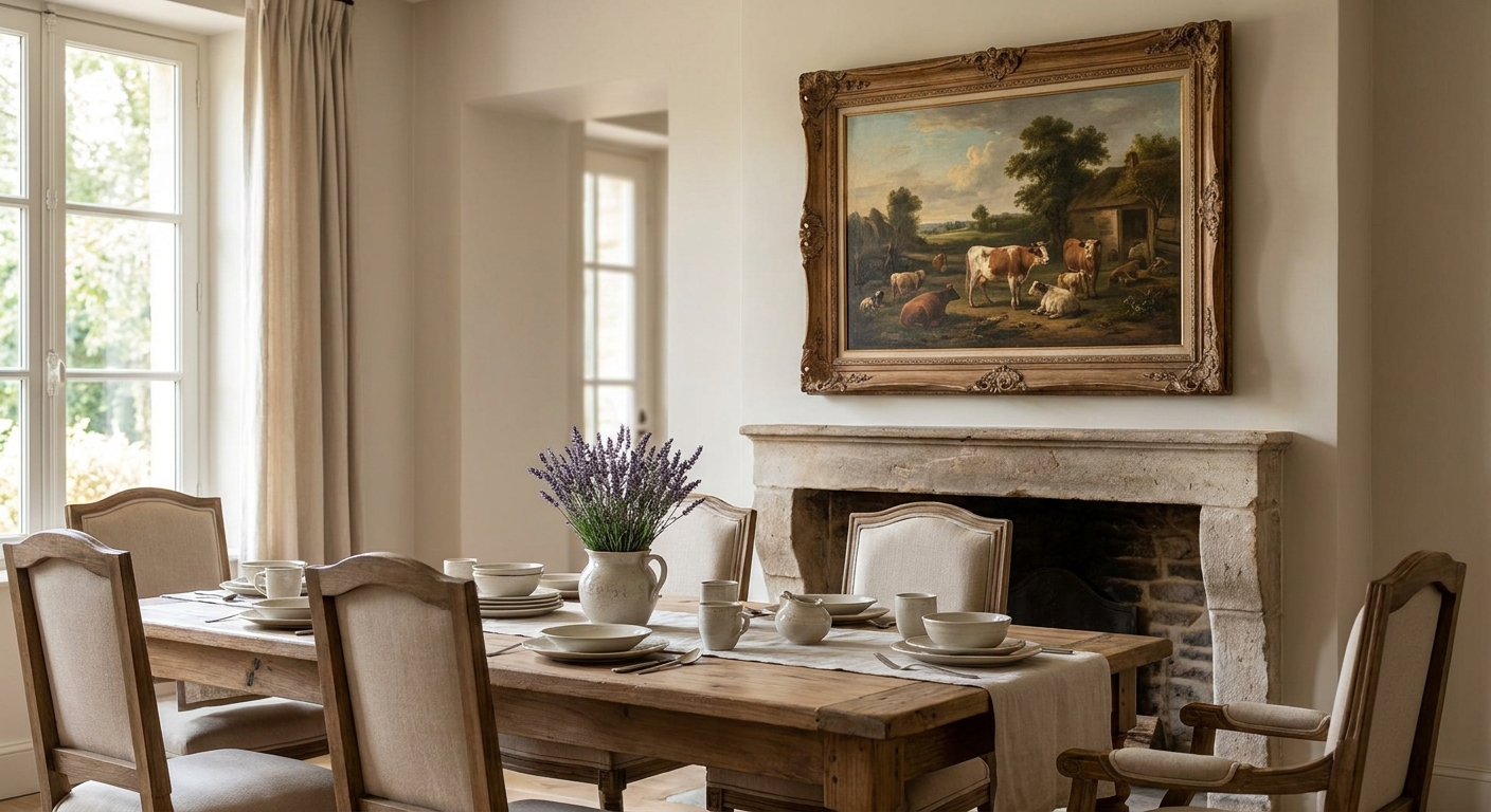
French Provincial wall art turns a dining room from "nice table" to "where dinner parties actually want to linger." This guide breaks down what makes provincial artwork work for classic dining spaces, which pieces earn a spot above your sideboard, and what to skip even if it looks pretty in a thumbnail.
- Lumiere d'Amour - Light of Love wins for a romantic, soft-palette anchor piece above a buffet in 2026 dining rooms - buy it.
- Provincial artwork works best in muted greens, dusty blues and warm creams, not high-saturation modern prints.
- Scale matters more than subject: a 30x40 canvas over a sideboard reads intentional, a 16x20 reads like an afterthought.
- Skip anything with metallic frames or glossy black mats - they fight the soft, worn-in look Provincial style depends on.
Why this matters
Classic dining rooms live and die by their wall art because the table itself rarely changes - the chairs, the linens, the sideboard stay put for years. The art is the one element you can swap to keep the room from going stale, and provincial artwork specifically solves a problem plain florals and generic landscapes don't: it reads formal enough for dinner parties but warm enough for a Tuesday night dinner with the kids.
Provincial style pulls from French countryside interiors - toile patterns, garden scenes, soft romantic imagery, aged color palettes. Get the wrong piece (too modern, too bold, too glossy) and it clashes with the wainscoting, the wood tones, the whole reason you went classic in the first place. The dining room wall art guide covers scale and placement basics if you want the fuller picture before diving into provincial specifics.
Who this is for
This is for anyone with a classic or traditional dining room - crown molding, a wood table, maybe a chandelier - who wants art that feels collected rather than matched from a showroom. It's for the shopper who likes farmhouse tables but wants something a notch more refined, and for anyone hosting holiday dinners in 2026 who wants the room photographed well without looking staged.
What to look for in provincial artwork for classic dining rooms
Muted, warm color palettes
Provincial artwork leans on sage greens, dusty blues, cream, and faded rose - never neon or high-contrast black-and-white. A piece with warm undertones sits naturally against wood furniture and traditional trim, while cool-toned modern prints fight the room instead of finishing it.
Garden, countryside or romantic European subject matter
Look for floral gardens, European city scenes, or soft romantic imagery rather than abstract shapes or geometric patterns. The subject matter is what signals "provincial" to a room - swap it for anything too graphic and the whole classic feel collapses.
A frame that reads as furniture, not hardware
Thin black metal frames belong in modern living rooms, not provincial dining rooms. A wood-tone or antiqued frame ties the art to the table and chairs instead of standing apart from them, and it's the detail most people notice without knowing why the room feels off.
Scale proportional to your wall, not your table
A common mistake is sizing art to the sideboard instead of the wall behind it. For a classic dining room, aim for artwork that covers roughly two-thirds the width of the furniture below it - a 30x40 canvas over a 60-inch buffet, for example, rather than something the size of a dinner plate.
Canvas texture over glossy poster finish
Provincial style is about a lived-in, slightly worn feel. A matte or lightly textured canvas print holds that mood far better than a glossy poster finish, which reflects dining room chandelier light and reads cheap under close inspection.
Odd-numbered groupings over single statement pieces
A single large canvas works over a buffet, but for a longer dining wall, three smaller framed pieces in a row read more traditionally provincial than one oversized print. If your dining room shares a wall with a gallery arrangement, the gallery wall arrangement guide walks through spacing so the grouping doesn't look accidental.
Top picks for classic dining rooms
Lumiere d'Amour - Light of Love is the safe pick. Priced at $179.99, it carries a soft, romantic palette that reads Parisian without tipping into kitsch, and it's sized to work as a single anchor piece above a sideboard or buffet. Buy it if you want one piece that does the whole room's talking.
Luxembourg is the garden-view pick. Also $179.99, the muted greens and formal garden imagery echo the structured, classic feel a traditional dining room wants, and it pairs well with wood-tone frames already in the room. Buy it for a wall that needs a quieter, more architectural feel than a floral close-up gives.
Autumnat Rosenborg is the warm accent. At $179.99, the rust and amber tones bring warmth to a dining room that leans heavy on dark wood, and it works well as the center piece in a three-print grouping. Consider it if your room already has a strong anchor piece and needs a secondary tone to balance the palette.


What to avoid
- High-gloss black-and-white photography. It's a strong look for a modern kitchen but it flattens the warmth a provincial dining room depends on - stick to color palettes with cream, sage, or dusty rose instead.
- Oversized abstract canvases. Bold geometric abstracts read contemporary no matter how muted the color palette is, and they clash with the softness of a traditional table setting.
- Thin, ultra-modern metal frames. Even a beautiful provincial print loses its warmth in a stark black metal frame - swap for a wood-tone or antiqued finish before hanging.
Verdict comparison
| Pick | Best For | Palette | Verdict |
|---|---|---|---|
| Lumiere d'Amour - Light of Love | Single anchor over a sideboard | Soft rose, cream | Buy |
| Luxembourg | Formal, architectural walls | Muted sage green | Buy |
| Autumnat Rosenborg | Three-print groupings, warm accent | Rust, amber | Consider |
For farmhouse-adjacent dining rooms that want a more rustic edge than pure provincial, the country interiors wall art guide covers where the two styles overlap and where they split.
FAQ
What is provincial artwork?
Provincial artwork refers to art inspired by French countryside interiors - garden scenes, romantic European imagery, and muted, warm color palettes like sage green, cream and dusty rose. It's a softer, more traditional cousin of farmhouse style, built for classic dining rooms and living spaces rather than modern minimalist ones.
What size wall art works over a dining room sideboard?
Aim for a canvas covering roughly two-thirds the width of the furniture below it. A 60-inch sideboard pairs well with a 30x40 canvas, while a narrower 40-inch buffet suits something closer to 24x30.
Is provincial style the same as farmhouse?
No - farmhouse leans rustic with distressed wood and neutral tones, while provincial style pulls from French countryside romance with garden imagery and softer, warmer palettes. They overlap in warmth but farmhouse skews more casual and provincial skews more formal.
Should dining room wall art be one large piece or a grouping?
Both work depending on the wall. A single large canvas suits a sideboard wall, while three smaller framed pieces in a row suit a longer dining wall and read as more traditionally provincial than one oversized print.
What colors work best for provincial dining room art?
Sage green, dusty blue, cream, and faded rose are the core provincial palette in 2026. Avoid high-contrast black-and-white or neon tones, which read modern rather than classic.
Can provincial artwork work in a small dining room?
Yes, as long as the scale is adjusted down proportionally - a single 16x20 or 20x24 canvas over a small buffet keeps the provincial warmth without overwhelming a compact room.
What frame style fits provincial wall art best?
Wood-tone or antiqued frames fit provincial style far better than thin black metal, which reads too modern for the softer, lived-in look the style depends on.
One last thing
The detail most people skip: hang provincial art at 57 inches to the center of the piece, not eye level from a standing position. Dining rooms are a seated-height room for most of the evening, and art hung to standing eye level reads too high once everyone sits down for dinner.


