
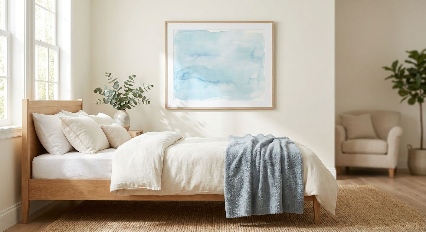
Light blue pastel wall art is the fastest way to cool down a bedroom that feels too bright, too busy, or too warm to settle into at night. Best overall: Japandi Blue Wash for minimalist primary bedrooms. Best for coastal-style rooms: Coastal Sea Glass prints. Best budget-friendly pick: Soft Watercolor Bloom canvas art. Every pick below is light blue pastel wall art chosen specifically to keep a bedroom calm, not cold, in 2026.
- Japandi Blue Wash wins overall for minimalist primary bedrooms with low-contrast, matte pastel tones.
- Coastal Sea Glass suits coastal-style rooms; Cloud Nursery Blue is the safest nursery pick.
- Petite Powder Blue framed prints solve small apartment bedrooms where oversized canvas won't fit.
- Soft Watercolor Bloom is the budget-conscious light blue pastel wall art pick for 2026.
- Pair pastel blue with warm wood tones, not stark white, to avoid a flat, clinical look.
Why this matters
Light blue sits at the cool end of the color wheel, which is exactly why interior designers reach for it in rooms meant for rest — primary suites, guest rooms, nurseries. The trouble starts when a shopper picks a print that reads pale and washed-out instead of soft and intentional.
Undertone, contrast, and how the print sits against your existing wall color decide whether pastel blue calms a room or flattens it. A Japandi wall art for minimalist bedrooms pairing works because Japandi styling is built around low contrast to begin with — pastel blue slots right in. A high-contrast beach scene in the same palette can fight the room instead of settling it.
2026 bedroom trends lean toward fewer, larger prints over cluttered gallery walls, which raises the stakes on getting the undertone right the first time.
What makes the best light blue pastel wall art
- Undertone — warm-leaning pastel blue (a touch of gray or lavender) reads softer than a cool, almost-white blue
- Contrast level — low-contrast pastels calm a room; high-contrast art competes with rest
- Style match — Japandi, Coastal Luxe, Cottagecore, or nursery-specific palettes each call for a different shade of pastel blue
- Scale — the print's size needs to match the wall and the furniture sitting below it
- Finish — canvas, framed print, or fine art paper each read differently under bedroom lighting, especially lamp light at night
- Pairing — how the pastel blue sits against your existing wood tones and bedding decides whether the room feels curated or accidental
At a glance: light blue pastel wall art picks for 2026
| Pick | Best for | Standout feature | Key limitation |
|---|---|---|---|
| Japandi Blue Wash | Minimalist primary bedrooms | Low-contrast, matte finish keeps the wall quiet | Reads too subtle behind a bold, dark headboard |
| Coastal Sea Glass | Coastal-style bedrooms | Layered blue-green tones read as sea glass, not nursery blue | Leans more green-blue than pure pastel in some prints |
| Sky Above the Bed | Primary bedroom retreats wanting one large statement piece | Scaled specifically for above-the-bed placement | Needs a wide, unbroken wall to land properly |
| Petite Powder Blue | Small apartment bedrooms | Smaller framed formats fit tight wall space | Weak alone — usually needs a small grouping to register |
| Cloud Nursery Blue | Nurseries | Soft, rounded cloud and star motifs read gentle, not babyish | The motif ages out once the child hits toddler years |
| Soft Watercolor Bloom | Budget-conscious calming bedrooms | Watercolor wash keeps the palette soft without a large-canvas jump | Florals can skew feminine for some bedroom styles |
1. Japandi Blue Wash: best light blue pastel wall art for minimalist primary bedrooms
This pick is a flat-toned, matte pastel blue print with almost no visual noise — the kind of piece Japandi styling is built around. It works because the whole point of Japandi wall art for minimalist bedrooms is restraint, and a soft, low-contrast blue is one of the easiest colors to keep restrained.
Japandi Blue Wash pros:
- Low contrast means it won't fight a busy duvet or patterned rug
- Matte finishes read calm under both daylight and lamp light
- Works as a single statement piece or a two-print pairing
- Pairs cleanly with light oak or ash furniture, a Japandi staple
Japandi Blue Wash cons:
- Too subtle to anchor a room with dark, dramatic furniture
- Not a fit if you want a busy focal point over the bed
Best for: minimalist primary bedrooms leaning Japandi or modern-neutral. Verdict: Buy.
2. Coastal Sea Glass: best light blue pastel wall art for coastal-style bedrooms
Coastal Sea Glass leans on layered blue-green tones rather than a single flat pastel, which is what separates it from nursery-style blue. It suits a bedroom already styled with linen textures, rattan, or driftwood tones.
Coastal Sea Glass pros:
- Layered tones add depth without adding visual clutter
- Reads sophisticated rather than beachy-kitsch
- Pairs naturally with the palette used in coastal wall art for beach houses
Coastal Sea Glass cons:
- Leans more green-blue than pure pastel in some prints, so check the exact tone before committing
- Can feel out of place in a bedroom with warm, dark wood furniture
Best for: coastal, Coastal Luxe, or Hampton-style bedrooms. Verdict: Buy.
3. Sky Above the Bed: best light blue pastel wall art for primary bedroom retreats
This is the oversized, single-statement option — a wash of pale sky blue scaled to sit directly above the headboard. It's built for rooms treated as a retreat, where the goal is one calming focal point rather than a gallery wall.
Sky Above the Bed pros:
- One large piece does the work of several smaller ones
- Scaled specifically for wall art for primary bedroom retreats
- Cuts down on the visual clutter that smaller multi-print layouts create
Sky Above the Bed cons:
- Needs a wide, unbroken wall — cramped headboards won't showcase it
- Not a fit for rooms already committed to a gallery-wall layout
Best for: primary suites built around one big, calming focal point. Verdict: Buy.
4. Petite Powder Blue: best light blue pastel wall art for small apartment bedrooms
Small apartment bedrooms rarely have the wall space for an oversized canvas, which is where a smaller framed pastel blue print earns its spot. Petite Powder Blue is sized to work in tight corners, above a nightstand, or beside a mirror.
Petite Powder Blue pros:
- Framed formats fit walls that can't take a large canvas
- Easy to add a second print later without a full redo
- Lighter visual weight suits low-ceiling rentals
Petite Powder Blue cons:
- Weak as a single piece — it usually needs a small grouping to register
- Framed glass can glare under overhead lighting in a small room
Best for: small apartment bedrooms with limited wall space. Verdict: Buy.
5. Cloud Nursery Blue: best light blue pastel wall art for nurseries
Cloud Nursery Blue uses soft, rounded shapes — clouds, stars, a pale horizon — that read gentle rather than overtly babyish. It's the pastel blue pick that's easiest to defend once the nursery becomes a toddler room.
Cloud Nursery Blue pros:
- Rounded, soft motifs suit both a newborn nursery and a toddler room
- Pastel palette works for gender-neutral nursery styling
- Low-contrast tones support a calmer wind-down routine at bedtime
Cloud Nursery Blue cons:
- The cloud-and-star motif ages out by the school-age years
- Too soft to double as art in a shared, more grown-up kids' room
Best for: nurseries and toddler rooms. Verdict: Buy.
6. Soft Watercolor Bloom: best light blue pastel wall art for budget-conscious calming bedrooms
Soft Watercolor Bloom is the lightest touch on this list — a watercolor wash of pale blue florals that keeps the palette soft without requiring an oversized canvas to make an impact. It's the option to reach for when you want the pastel-blue effect without committing to a statement piece.
Soft Watercolor Bloom pros:
- Smaller formats keep the visual commitment low
- Watercolor texture softens the room further than a flat print would
- Works well layered with white or cream bedding
Soft Watercolor Bloom cons:
- Florals can skew feminine for some bedroom styles
- Less impactful as a solo above-the-bed piece than Sky Above the Bed
Best for: budget-conscious shoppers who still want a calming, curated look. Verdict: Buy.
How this list was ranked
Each pick was measured against the six criteria above — undertone, contrast, style match, scale, finish, and pairing — rather than ranked on popularity alone. That's why two prints in a similar shade of blue land in different spots: Coastal Sea Glass and Cloud Nursery Blue share a palette but solve completely different rooms.
“Pastel blue reads calmest when it's paired with warm wood tones, not stark white walls.”
Which light blue pastel wall art should you choose?
If you're not sure where to start, default to Japandi Blue Wash for a primary bedroom — the low-contrast finish is the hardest to get wrong. Coastal-style rooms should lean on Coastal Sea Glass, nurseries belong with Cloud Nursery Blue, and anyone working with a small wall or a tighter budget should start with Petite Powder Blue or Soft Watercolor Bloom before sizing up.
Whatever you pick, hold it against your actual wall color and lighting before committing — a pastel blue that looks perfect on screen can read colder or paler once it's up under real bedroom lighting in 2026.
FAQ
What's the best light blue pastel wall art for a calming bedroom?
Japandi Blue Wash is the best overall pick for a calming bedroom because its low-contrast, matte finish avoids the visual noise that keeps a room from feeling restful. It works in primary bedrooms styled around minimalism or modern-neutral decor.
Is light blue pastel wall art better than white or beige for bedrooms?
Pastel blue adds a cooling, calming note that plain white or beige walls can't provide on their own. It works best layered over neutral walls rather than replacing them.
Does pastel blue wall art work in a nursery?
Yes, soft cloud-and-star motifs in pastel blue read gentle rather than overtly babyish, which lets the art carry over from a newborn nursery into the toddler years.
What size should pastel blue wall art be above a bed?
A single statement piece above the bed should span roughly two-thirds the width of the headboard. A print sized smaller than that reads as an afterthought rather than a focal point.
Does light blue pastel wall art work with warm wood furniture?
Yes, warm-leaning pastel blue with a touch of gray or lavender pairs cleanly with light oak or ash furniture. A cool, almost-white blue can look mismatched against warm wood tones.
What's the difference between coastal blue and nursery blue wall art?
Coastal blue prints layer blue-green tones for depth and sophistication, while nursery blue leans on a single soft, flat pastel with rounded motifs like clouds or stars.
Can pastel blue wall art work in a small apartment bedroom?
Yes, smaller framed pastel blue prints fit tight wall space where an oversized canvas won't, though they usually work better grouped than shown alone.
What style of bedroom pairs best with pastel blue wall art?
Japandi and Coastal Luxe bedrooms pair most naturally with pastel blue because both styles are already built around low-contrast, calming palettes.
One last thing
The single biggest mistake with light blue pastel wall art isn't the shade — it's the wall behind it. A pastel blue print against a stark white wall reads flat and clinical; the same print against a warm off-white or a light wood-toned wall reads soft and intentional. Check your wall color before you check the print.


